FIBR.
The Fiber Co. became FIBR.: one spine, two print-ready pouches
- Client
- Nuvea Essentials — in-house brand
- Year
- 2026
- Services
- Brand brief, Naming, Identity, Brand guidelines, Pouch packaging, Label copy, Nutrition panels, Amazon main image
- Result
- 2 SKUs Final fronts and backs on one pouch system
- Brand brief
- Naming
- Logo & identity
- Brand guidelines
- Packaging system
- Packaging
- Label copy
- Amazon main image

Nuvea wanted a premium daily-fibre brand for India's gut-health generation, that could hold its own in Amazon and quick-commerce grids. The first round called it "the fiber co." and named three SKUs: Feel Fuller, ConstiFlow and Buty Boost.
A design contest then drew 298 entries, and all of them shared the same 12 defects. The brand still needed a mark that reads at thumbnail size, and a pouch system that changes colour per SKU without splitting the brand.
At 150 px only three things survive: colour, the wordmark and one number. Build the pack around those.
What we did.
FIBR. is Nuvea Essentials' own fibre brand. It started as "the fiber co." We wrote the brief and guidelines, renamed it FIBR., built a vertical-wordmark pouch system and took two SKUs, GLP-1 Support Fibre and ConstiFlow, to final fronts, backs and an Amazon main image.
Brief first
Brand pack v1 set one rule: the master brand is the hero, not the product name. Products are described, not nicknamed.
A name that runs up the pack
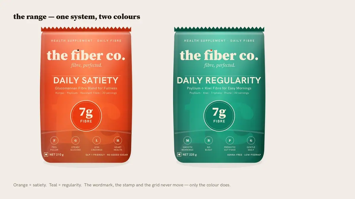
the fiber co. became FIBR. The wordmark runs bottom-to-top up the left edge of every pouch, with a coloured dot after the R.
Test at real size
Directions went through a dark quick-commerce tile mock, an Amazon search-grid mock and a legibility ladder from 420 px down to 56 px.
One system, one colour per SKU
Orange for GLP-1 Support Fibre, lime for ConstiFlow. The spine, the 7 g roundel, the UK flag and the 30-servings badge stay where they are.
Backs that read in order
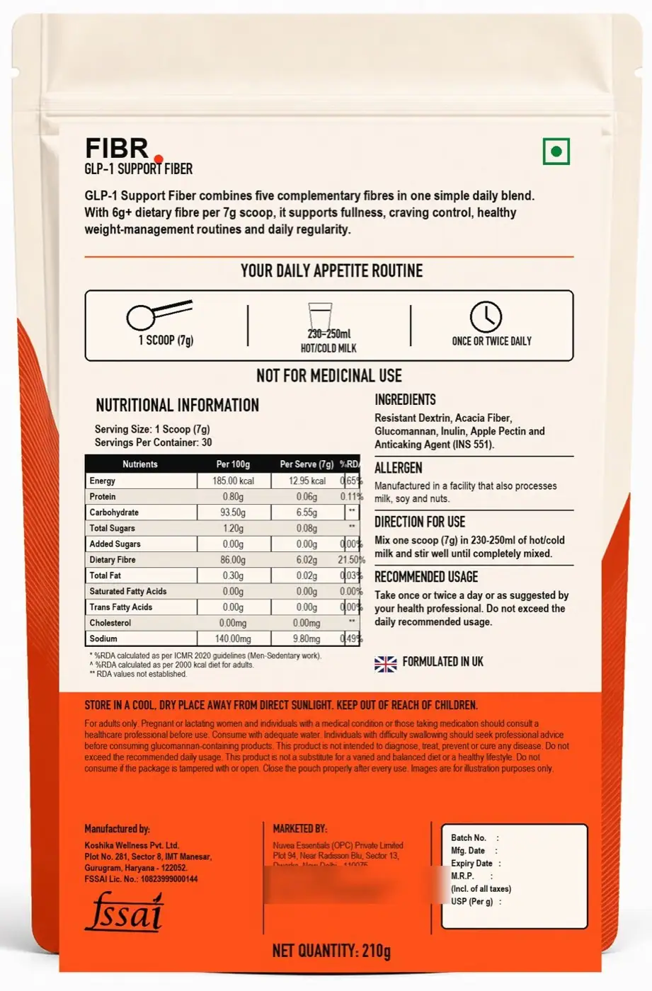
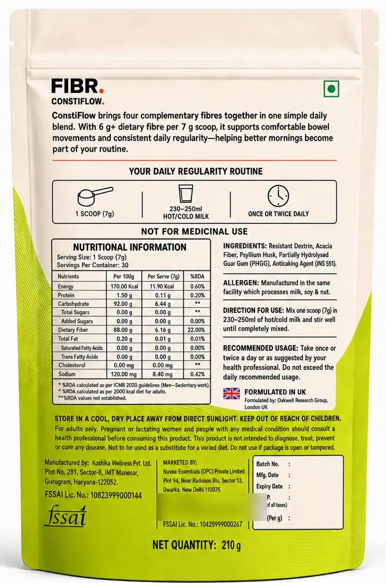
One paragraph on the blend, a three-step routine (1 scoop, 230–250 ml, once or twice daily), then nutrition, ingredients and the maker blocks.
Chapter by chapter.
10 chapters, in the order the brand was built.
A brief with one rule: the brand is the hero
Brand pack v1 (June 2026) put the brief, logo system, colour, type, packaging system, naming, mandatories, deliverables and visual references in one 17-page file.
Its rule: the master brand owns the face of the pack. Cutesy SKU names come off the front; a plain functional line describes the product.


From the fiber co. to FIBR.
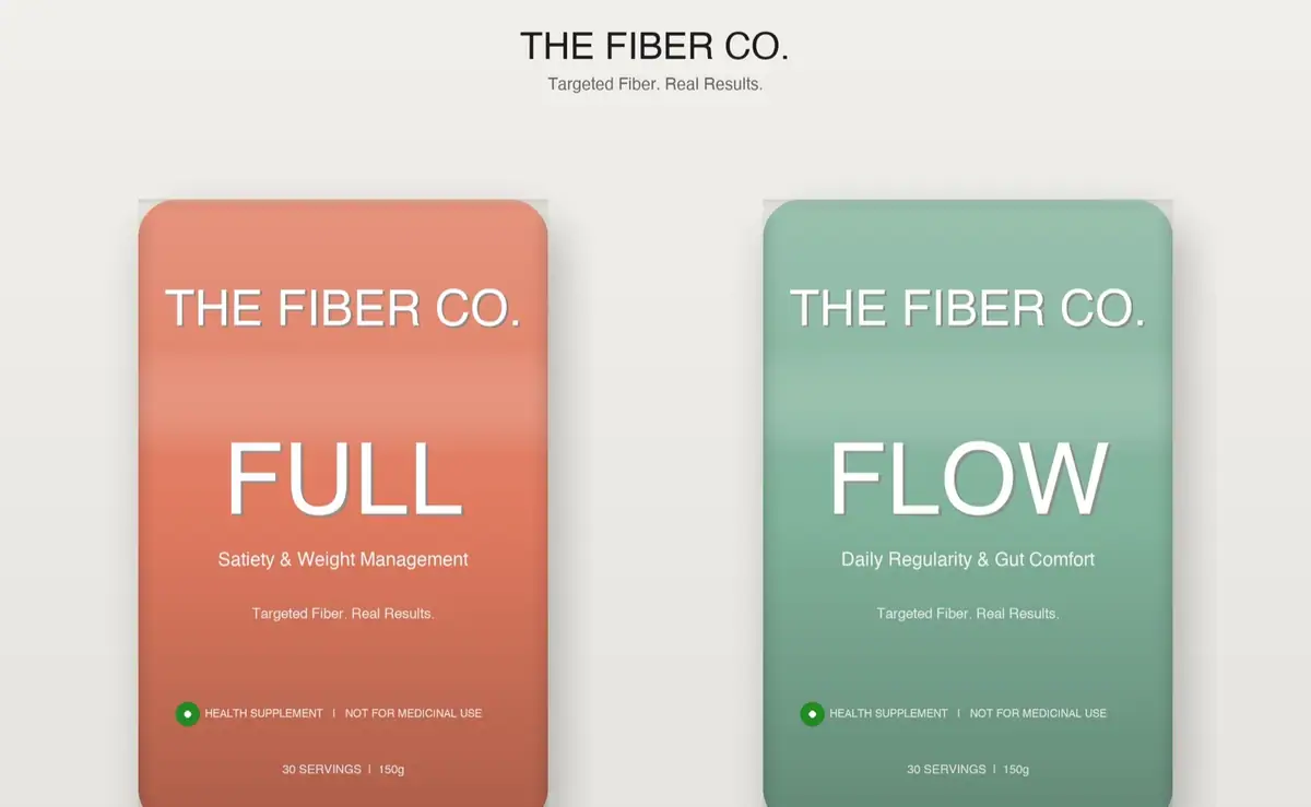
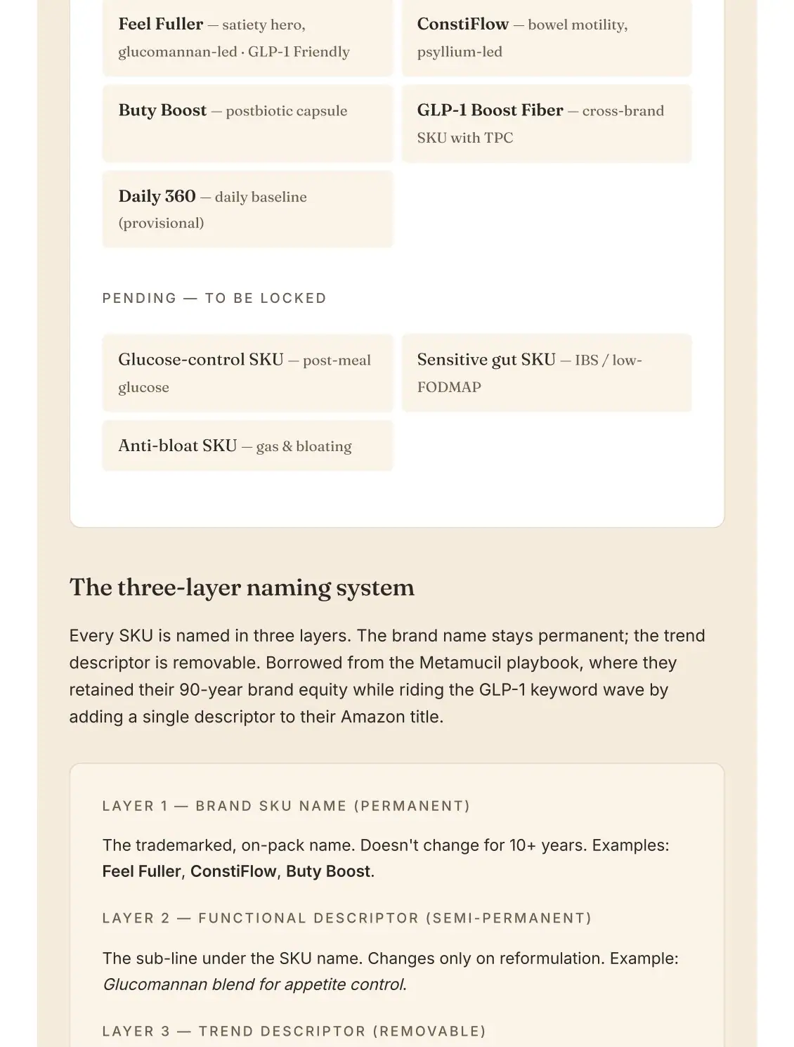
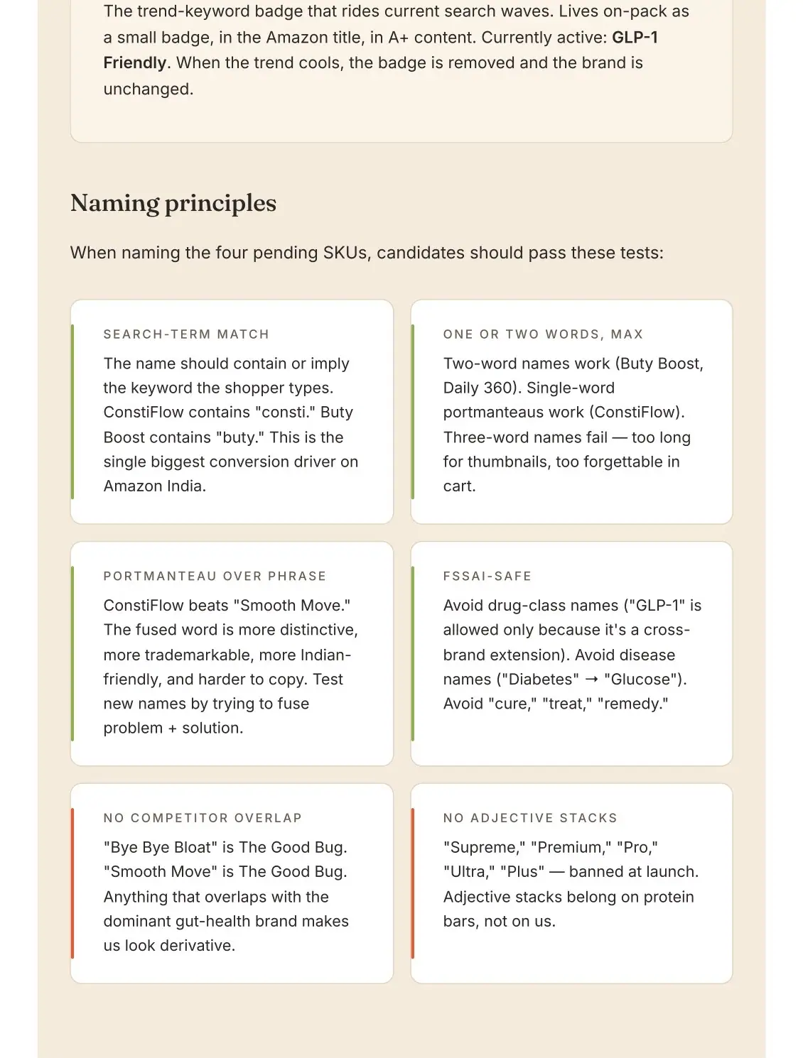
Two routes were explored for the same two-SKU brief: SUKHA with FULL and FLOW, and THE FIBER CO. with the same pair. The guidelines then locked "the fiber co." with a three-layer naming system: a permanent SKU name, a functional descriptor and a removable trend badge.
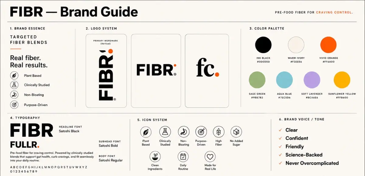
The brand was renamed FIBR., with "Targeted Fiber Blends" as its line. The satiety SKU ran as FULLR. in July drafts and settled on GLP-1 Support Fibre. ConstiFlow kept its name from the first list.
Wordmark, monogram, then a vertical spine
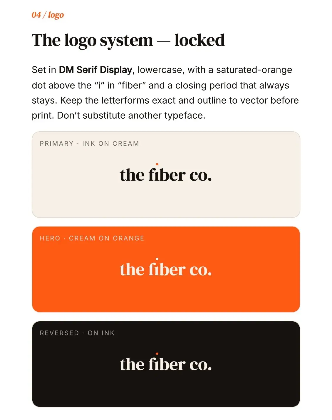
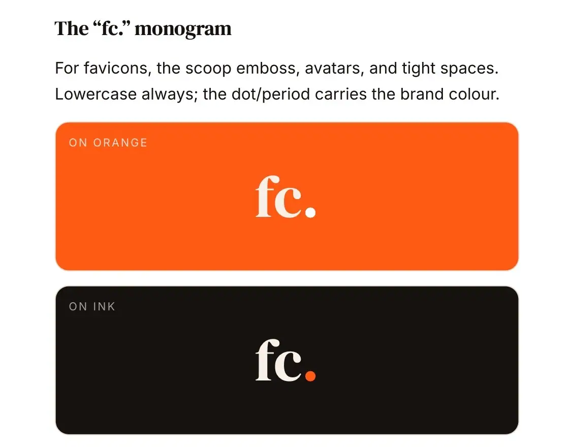
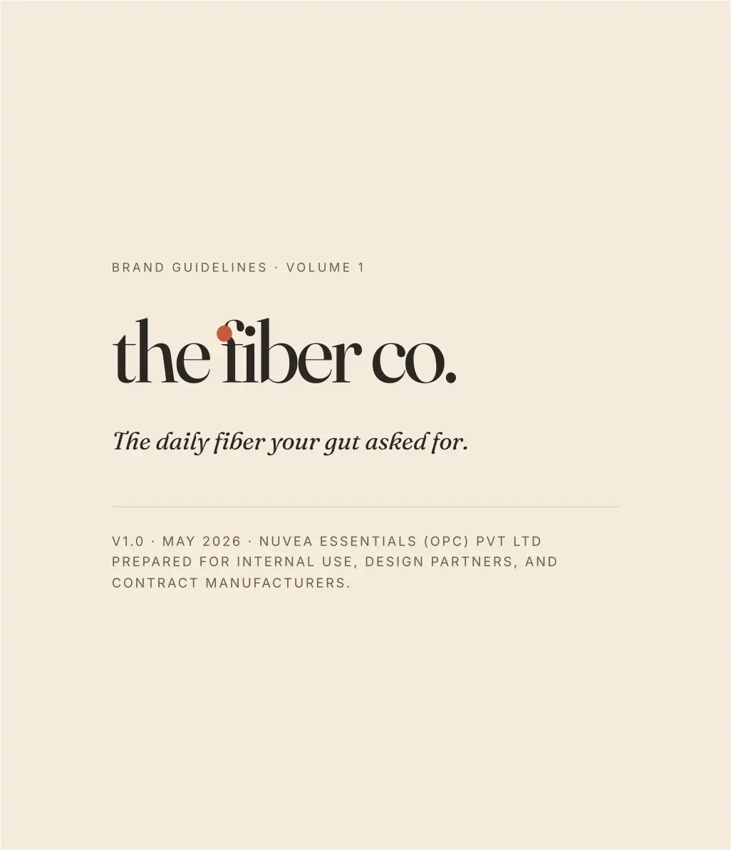
the fiber co. was set in a heavy lowercase serif, with an orange dot over the i and a closing period that always stays. The fc. monogram covers favicons, the scoop emboss and avatars.
We tested horizontal against vertical lockups. FIBR. kept the dot and the vertical read: a primary vertical wordmark, a horizontal lockup and the fc. sub-brand monogram.


28 pages for partners and manufacturers
Brand Guidelines v1.0 (May 2026) covers position, audience, architecture, wordmark, palette, a seven-hue SKU colour system, type, voice, naming, pouch and dieline, photography and a "never" list.
In July we added an 11-page gap analysis and designer brief, written after reviewing 298 contest entries. It lists the 12 defects they shared and the spec to fix each one.


Six directions, tested at thumbnail size
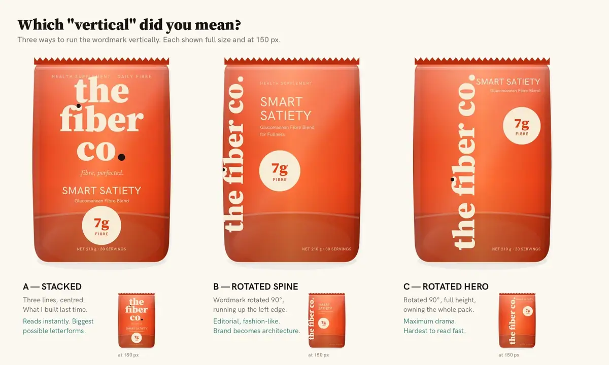
We ran six packaging directions and three ways to set the wordmark vertically: stacked, rotated spine and rotated hero. Each was checked full size and at 150 px.
Then the shelf tests: a dark quick-commerce tile mock, an Amazon grid mock and a legibility ladder from 420 px down to 56 px. The orange flood kept three reads all the way down: colour, wordmark and the 7 g stamp.



From the first pouch to the FIBR. spine
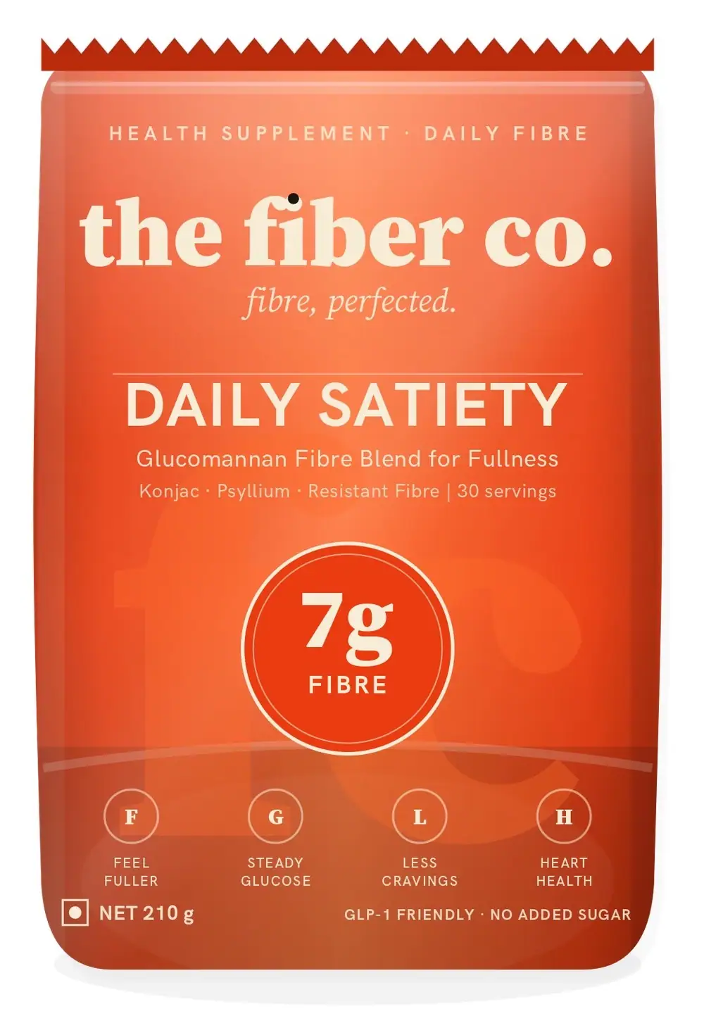
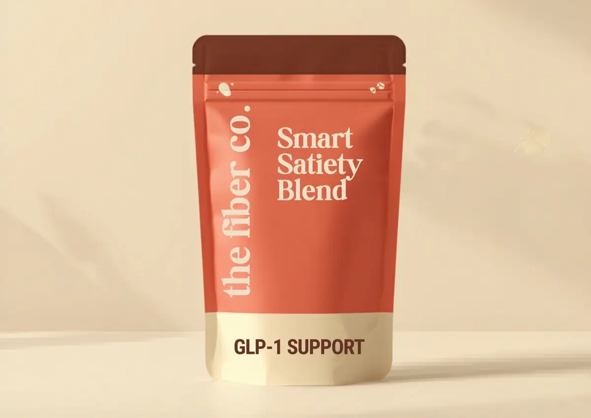
The first pouch, in May, set a vertical "the fiber co." beside Smart Satiety Blend. The first FIBR. drafts in July tried cream with lime, then sage.
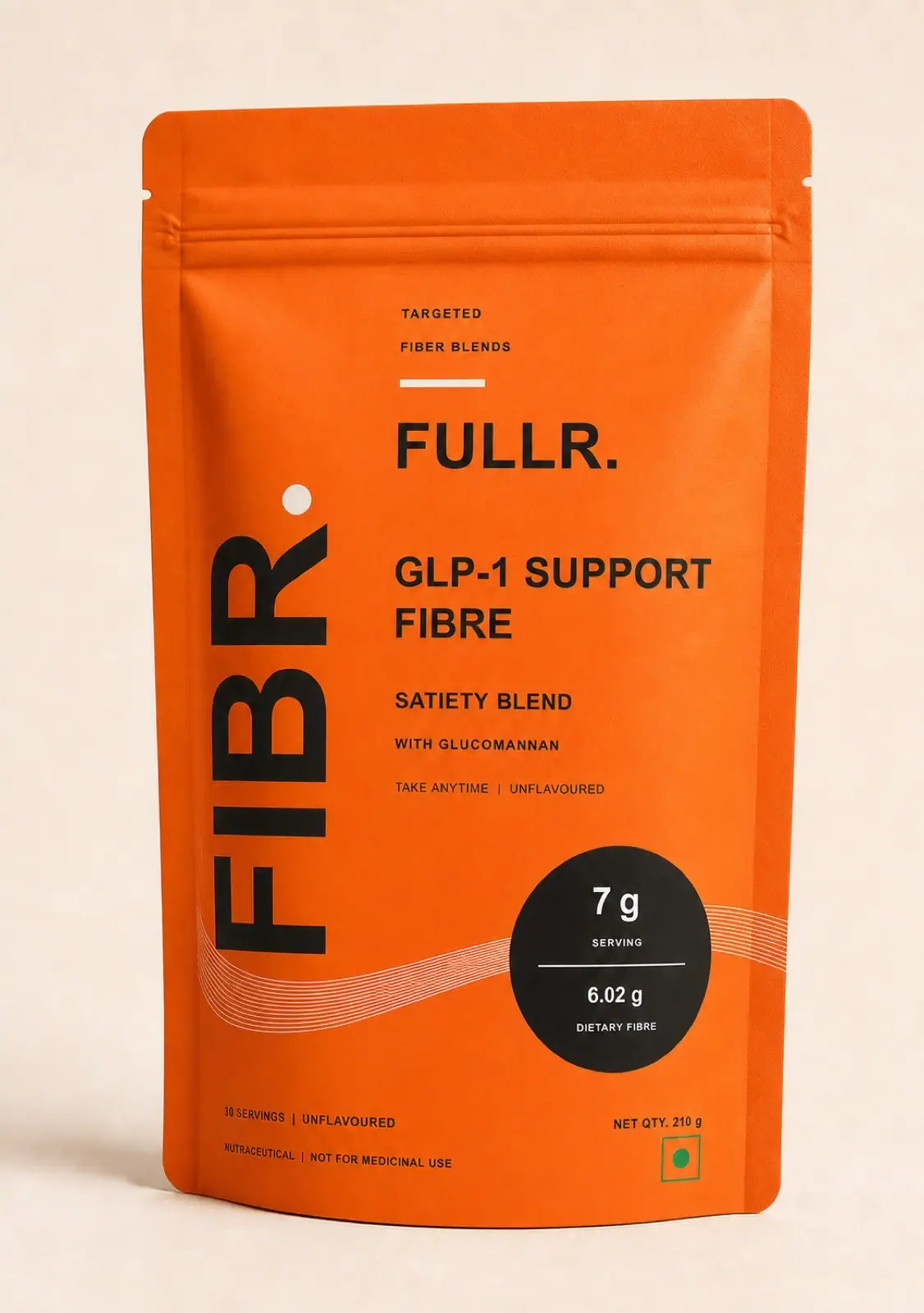
FULLR. moved to a tangerine front and butter-yellow back at 220 × 220 mm. In August the ConstiFlow layout became the system: cream top, colour wave, black roundel, with GLP-1 Support Fiber set in orange beside it.


GLP-1 Support Fibre: the satiety blend
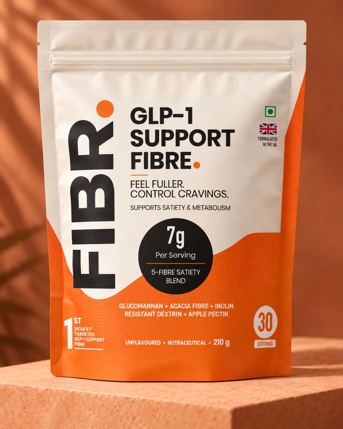
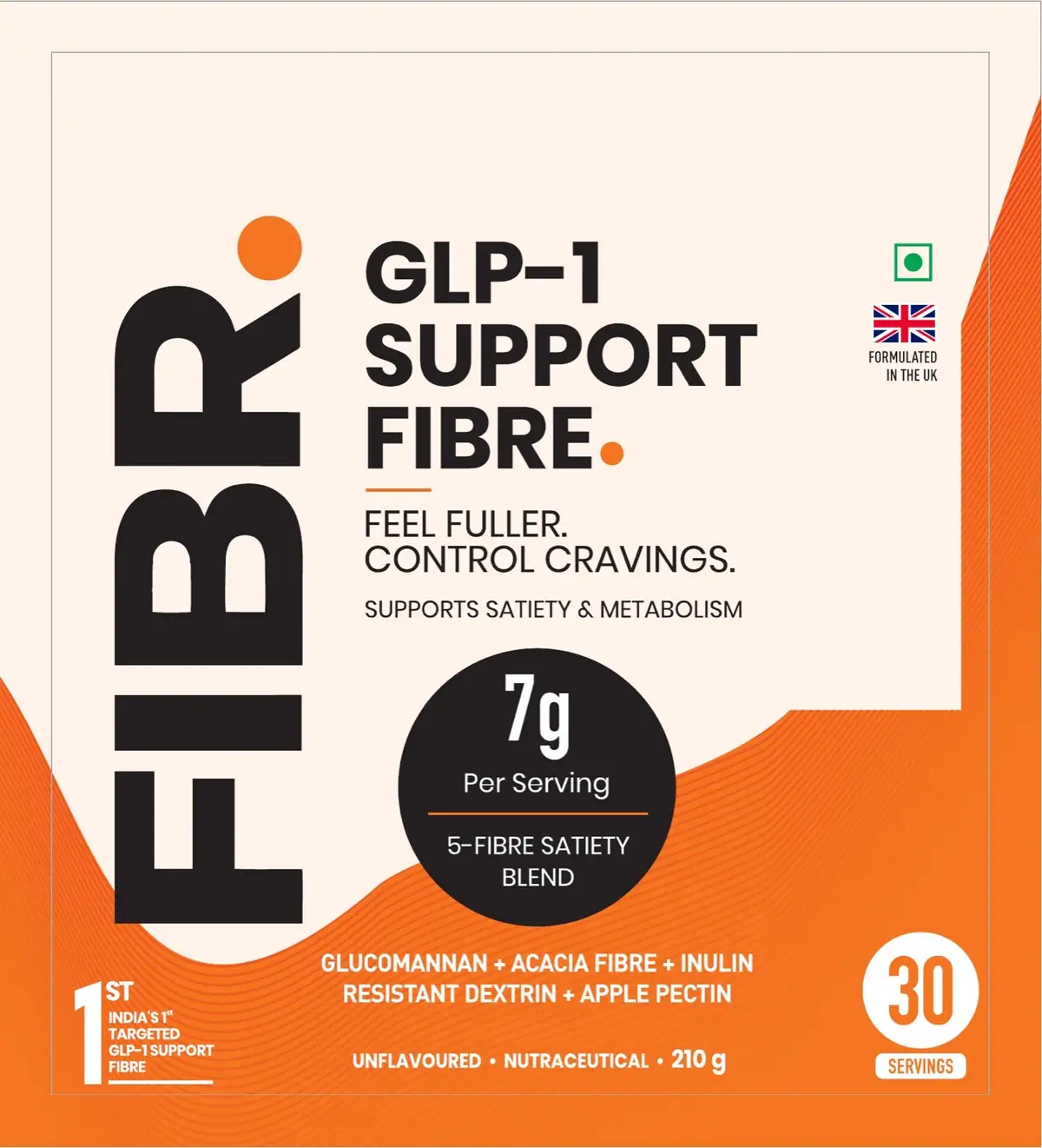
An orange wave, the vertical FIBR. spine, "Feel fuller. Control cravings." and a black 7 g roundel for the 5-fibre satiety blend: glucomannan, acacia fibre, inulin, resistant dextrin and apple pectin.
30 servings, 210 g, unflavoured, Formulated in the UK. The back carries a daily appetite routine and a nutrition table at 6.02 g dietary fibre per 7 g scoop.
ConstiFlow: same spine, lime and cream
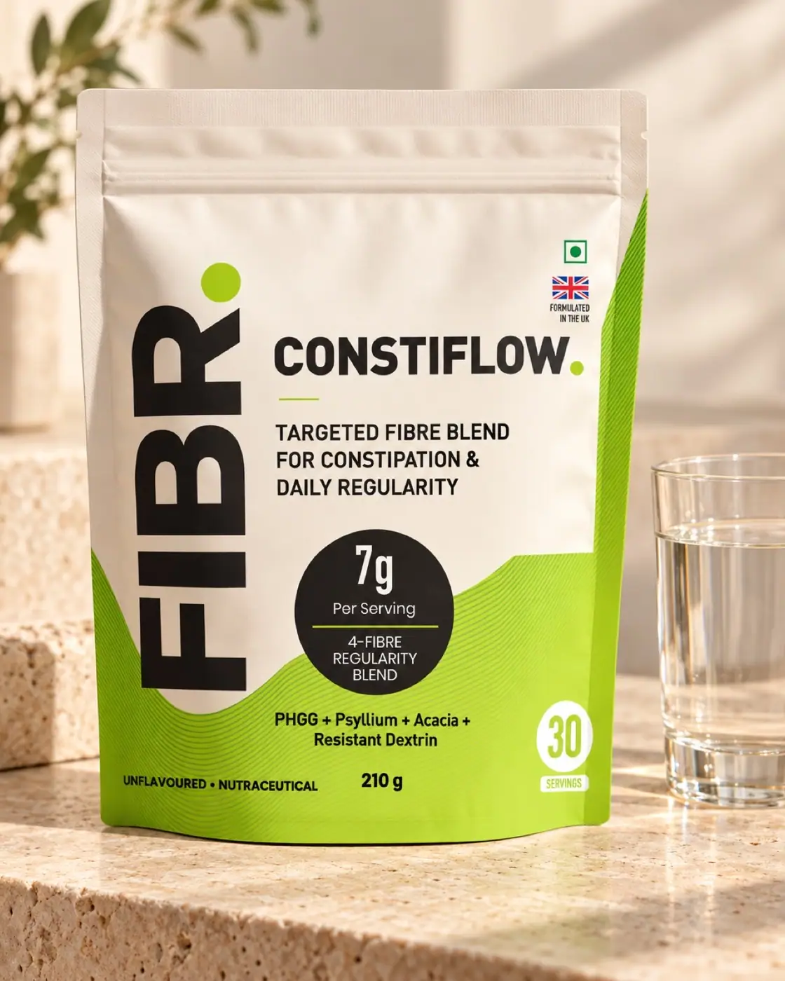
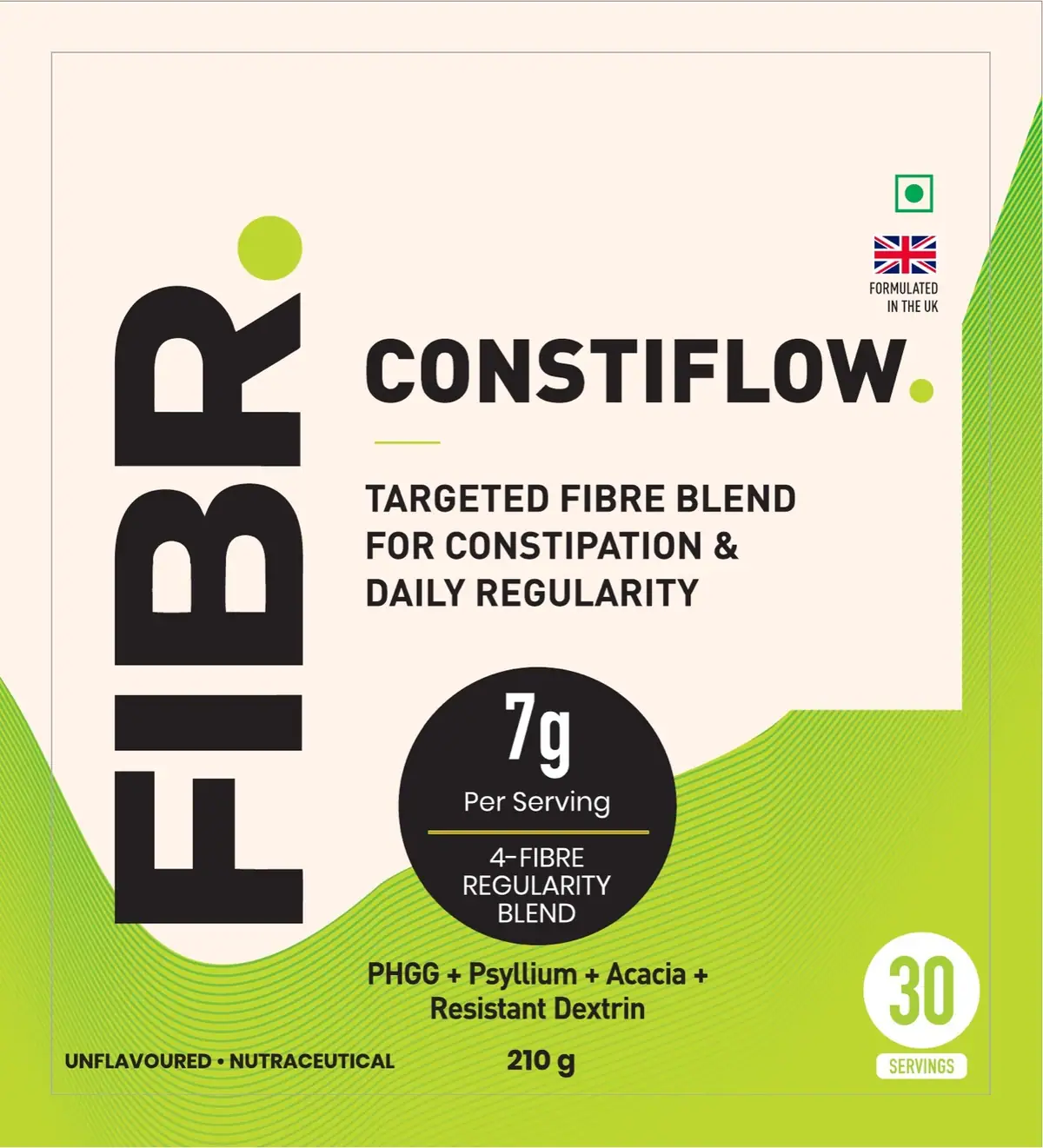
ConstiFlow swaps orange for lime and keeps everything else in place. The front reads "Targeted fibre blend for constipation & daily regularity" over a 4-fibre regularity blend: PHGG, psyllium, acacia and resistant dextrin.
The back gives 6 g+ dietary fibre per 7 g scoop, a three-step daily routine and the formulator: Oakwell Research Group, London.
Two SKUs, one system
The corrected finals from September 2026. Only the colour changes between SKUs. The wordmark, the 7 g roundel, the UK flag and the 30-servings badge hold their positions.
A main image built for the search grid
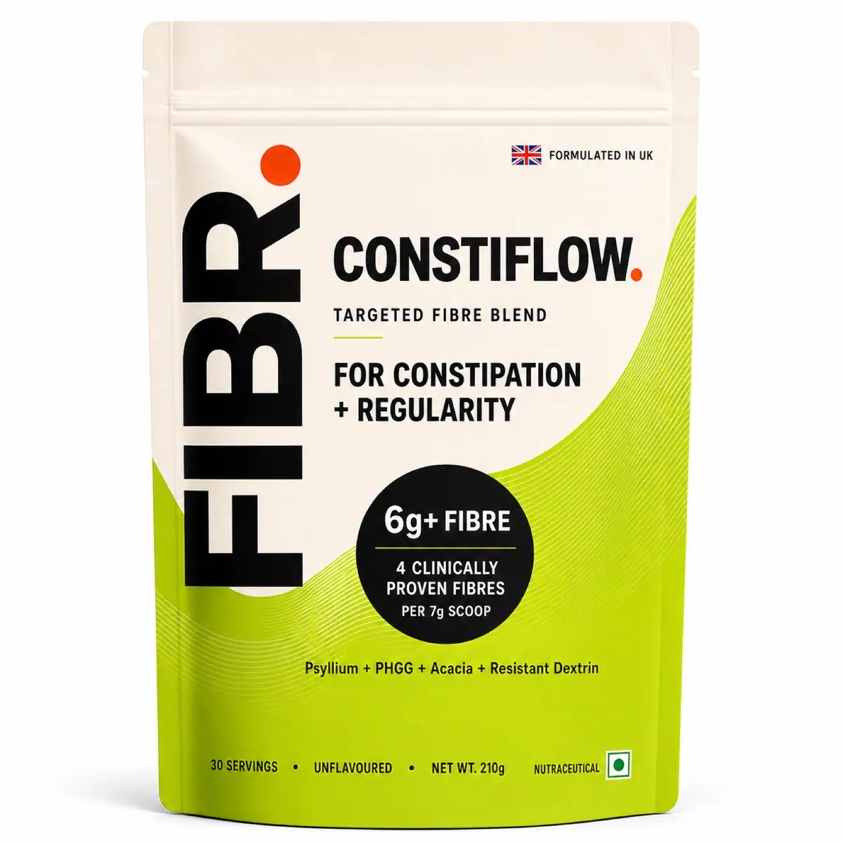
For Amazon we made a ConstiFlow main image on white, with 256 px thumbnail checks. The naming system already set where trend descriptors go: a small on-pack badge and the Amazon title, never the brand name.

GLP-1 Support Fibre + ConstiFlow, one system
Dietary fibre per 7 g serving
Explored before the system locked
Brand Guidelines v1.0
- Brand pack v1: brief, logo system, colour, type, naming, references (17 pages)
- Brand Guidelines v1.0 (28 pages)
- Gap analysis & designer brief v1.0 (11 pages)
- Naming: the fiber co. to FIBR., three-layer SKU naming system
- the fiber co. wordmark and fc. monogram
- Vertical and horizontal FIBR. wordmark
- 6 packaging directions and 3 vertical-lockup options
- Shelf and thumbnail tests: quick-commerce tiles, legibility ladder, Amazon grid
- GLP-1 Support Fibre pouch, front and back
- ConstiFlow pouch, front and back
- Label content and nutrition panels
- ConstiFlow Amazon main image
Got a product?
Let's give it a name.
Tell us what you're making, where you'll sell it and when you want it on shelf. We reply within one working day.