TRIDHI
Wellness, precisely. Identity, labels and bottles for TRIDHI.
- Client
- Client — functional-wellness brand & precision cellular-medicine clinic
- Year
- 2026
- Services
- Brand strategy, Visual identity, Brand guidelines, Label design, Packaging system, 3D mockups
- Result
- 14 pages Visual Identity System v1.0
- Brand strategy
- Logo & identity
- Brand guidelines
- Messaging
- Label design
- Packaging system
- 3D mockups

TRIDHI is two businesses under one name: a clinic for consultation and precision cellular care, and a range of nutraceuticals. The risk was obvious. It could read as a supplement company pretending to be a clinic, or as a clinic with no warmth.
It already had a circular green mark. The job was to build a system around that mark, not replace it, and to get two products onto print-ready labels.
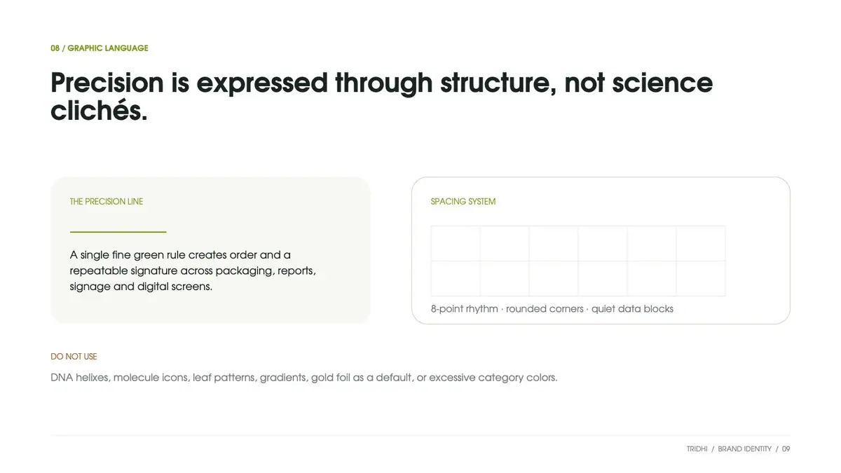
Precision is shown through structure, not science clichés.
What we did.
TRIDHI is a functional-wellness brand and precision cellular-medicine clinic from Nutri Genomics Private Ltd. We wrote its 14-page Visual Identity System, designed full-wrap labels for two SKUs and took the bottle from 54 variations to 4 shortlisted 3D mockups.
One idea, three expressions
Human plus precise became "Wellness, precisely." One master line, with its own tagline for the clinic, the formulas and the insights division.
Keep the mark
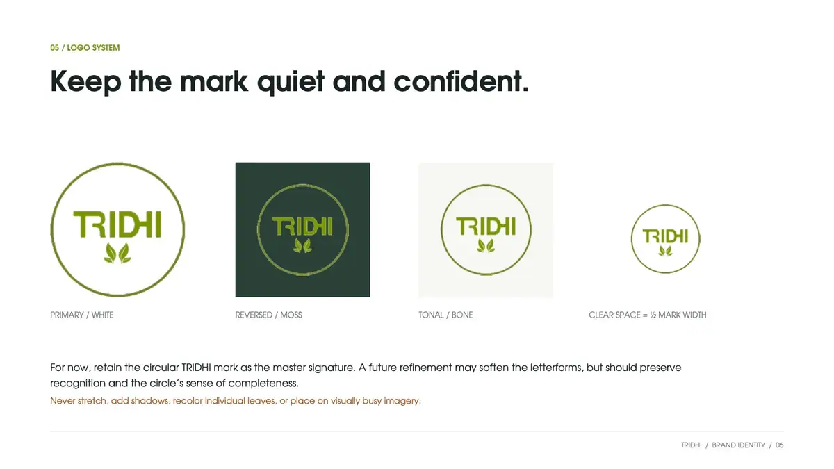
The circular TRIDHI mark stays as the master signature, in primary, reversed and tonal versions, with clear space set at half the mark's width.
White leads, green identifies
Six colours with a set balance: 75% white, 15% bone or stone, 8% moss, 2% cellular green. Poppins, an 8-point grid and a single fine green rule hold it together.
Labels with clear jobs
Front panel: product, extract, branded ingredient, strength, count. Side panels: composition, nutrition, recommended use and advisory.
54 bottles, 4 on the table
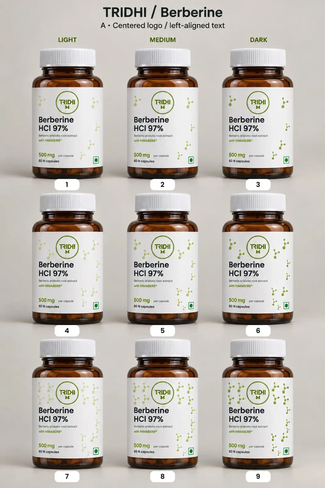
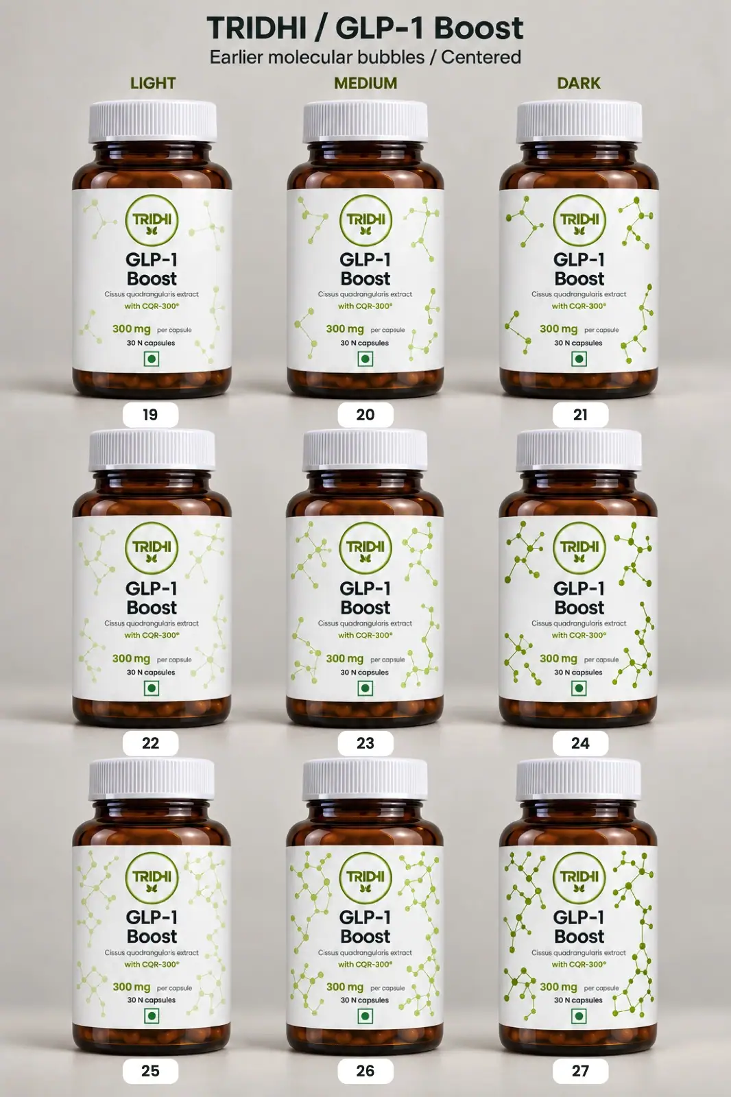
27 numbered variations per SKU across layout, bubble density and tone. Options 19, 22, 23 and 24 went forward as 3D mockups.
Chapter by chapter.
7 chapters, in the order the brand was built.
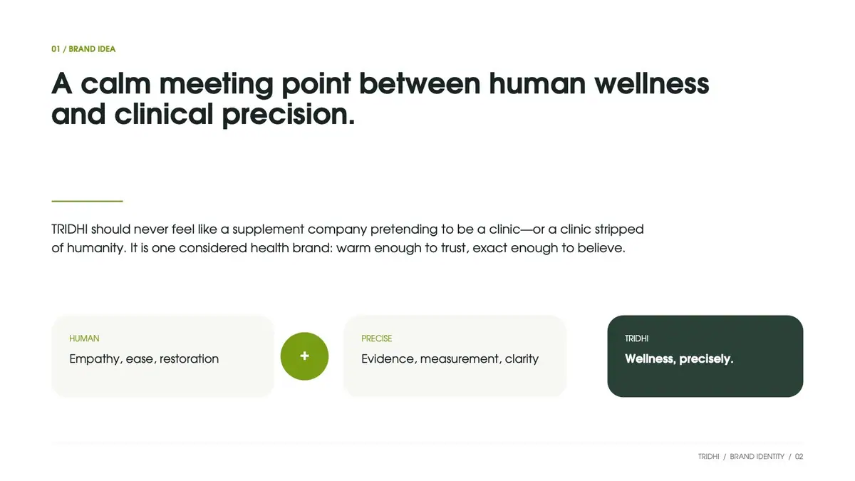
A calm meeting point of wellness and precision
The guide opens with the idea: human (empathy, ease, restoration) plus precise (evidence, measurement, clarity). The line that joins them is "Wellness, precisely."
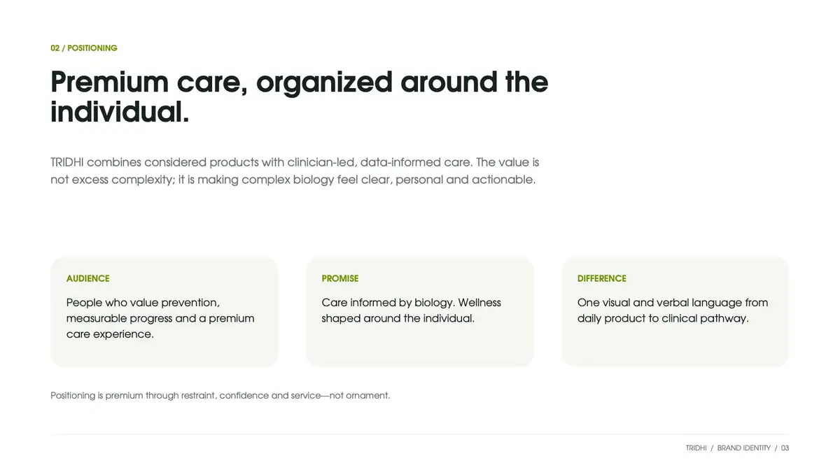
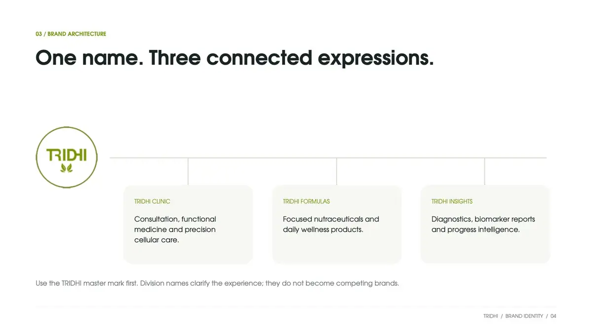
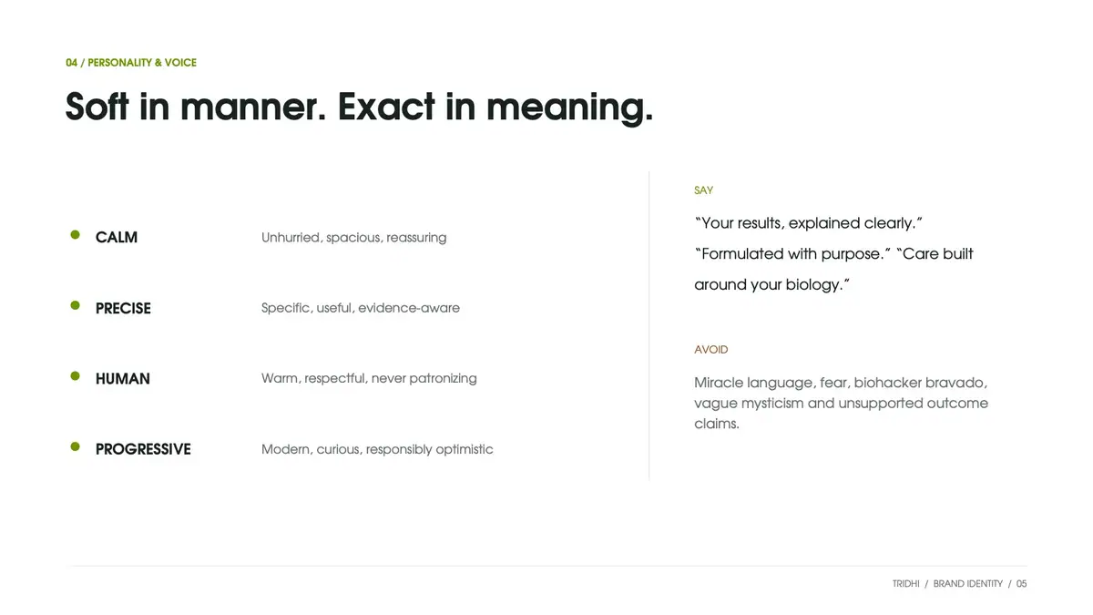
Positioning, voice and a three-part architecture follow. TRIDHI Clinic, TRIDHI Formulas and TRIDHI Insights clarify the experience; the master mark always comes first.
The existing mark, kept and set in a system
We kept the circular TRIDHI mark as the master signature and gave it rules: primary on white, reversed on moss, tonal on bone, and clear space of half the mark's width.
The guide plans a later refinement that may soften the letterforms while keeping the circle.
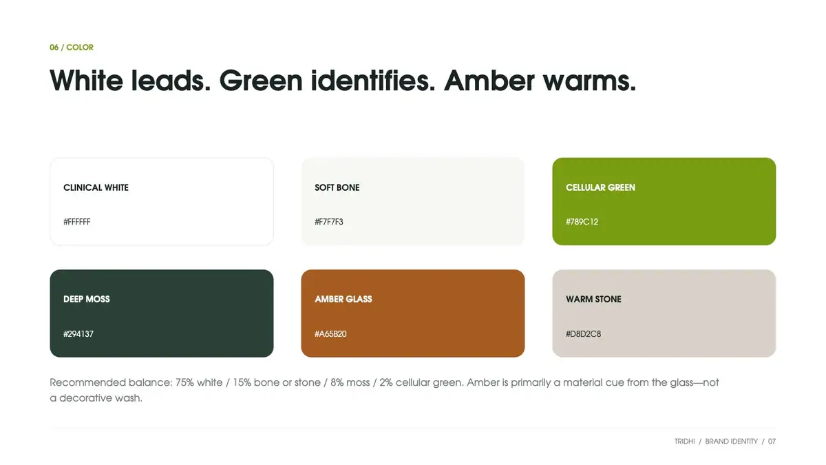
White leads. Green identifies. Amber warms.
Six named colours, from Clinical White to Cellular Green #789C12, Deep Moss and Amber Glass. Amber comes from the glass, not from decoration.
Poppins in sentence case, a maximum of two weights per surface, an 8-point grid and one fine green rule: the precision line. A messaging page gives each division its own line under the master promise.


Bottle, clinic and screen in one language
The guide shows the system at work: a white clinical label on amber glass with a white closure, a clinic reception, and a patient dashboard that uses the same white space and green accent.
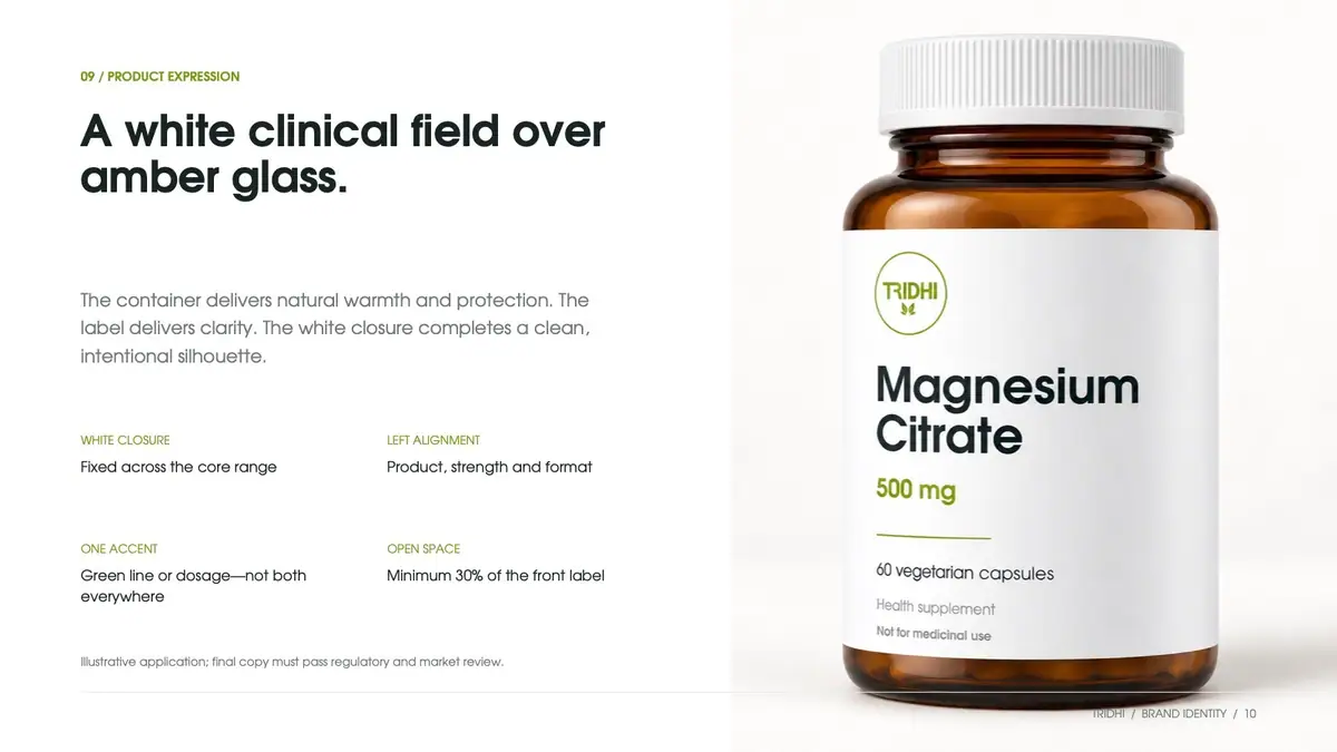
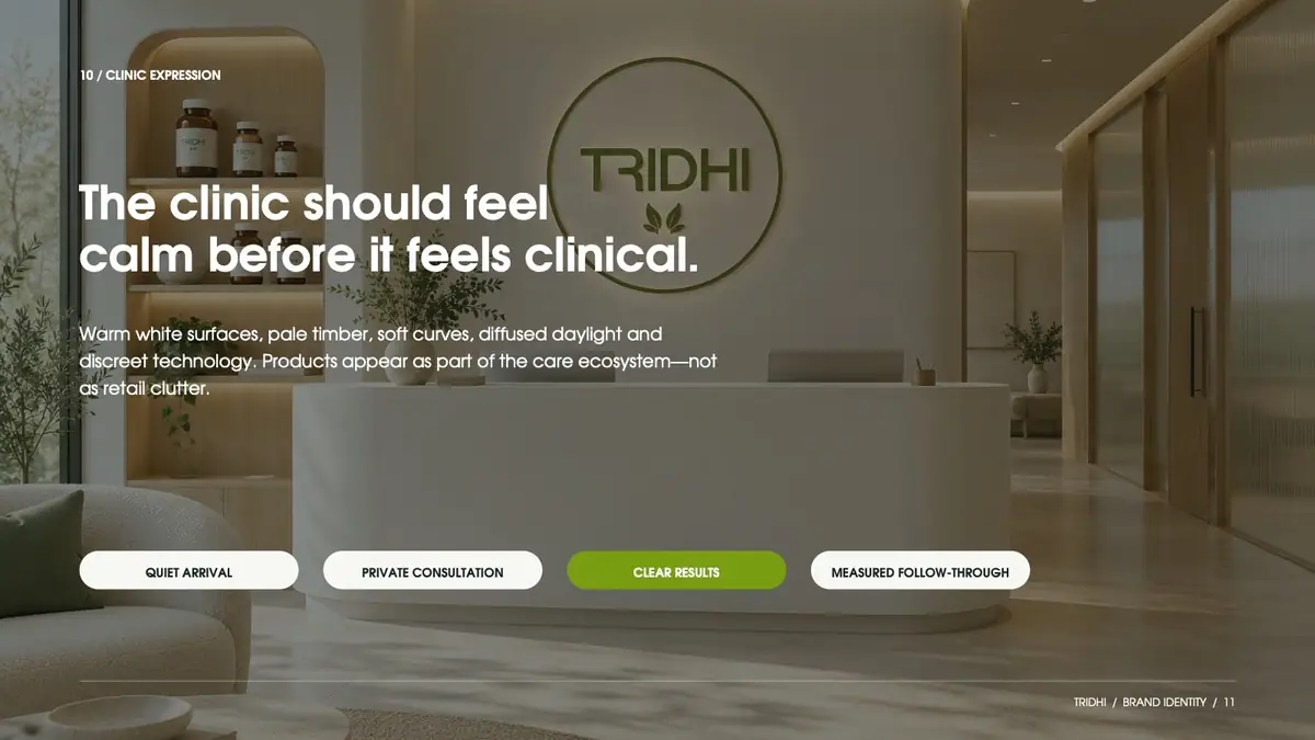
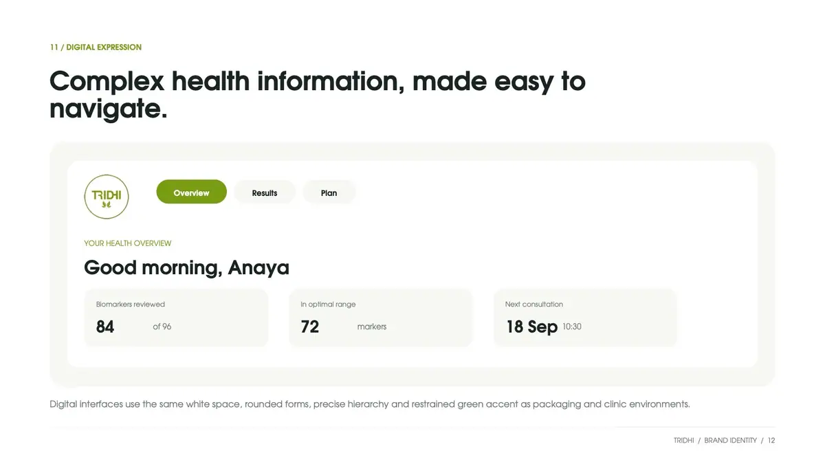
Two full-wrap labels, 6 × 2.5 inches
Berberine HCl 97% with HIMABERB® (500 mg, 60 capsules) and GLP-1 Boost with CQR-300® (300 mg, 30 capsules) share one print layout.
The front panel carries the TRIDHI mark, product name, extract, strength and count. Composition, nutrition, recommended use and advisory sit on the side panels.


54 numbered bottle variations
We mocked up 27 numbered variations per SKU: left-aligned and centred fronts, three bubble densities and light, medium and dark tones.

Four options, both SKUs side by side
Options 19, 22, 23 and 24 were rendered as matching 3D pairs, Berberine and GLP-1 Boost side by side, varying only bubble density and tone. No final pick is shown here.


Visual Identity System v1.0
Full-wrap labels, 6 × 2.5 in
Bottle variations to a 3D shortlist
Clinic, Formulas, Insights under one mark
- Visual Identity System v1.0 (14 pages)
- Brand idea, positioning and voice
- Three-part brand architecture: Clinic, Formulas, Insights
- Logo system built on the existing circular mark
- Colour palette, Poppins type rules and 8-point layout grid
- Precision-line graphic device
- Product, clinic and digital applications
- Messaging system and implementation plan
- Full-wrap labels, 6 × 2.5 in: Berberine HCl 97% and GLP-1 Boost
- 54 numbered bottle variations
- 4 shortlisted 3D bottle mockups
Got a product?
Let's give it a name.
Tell us what you're making, where you'll sell it and when you want it on shelf. We reply within one working day.