The Gut Doctor
A gut clinic with its own mark, inside a working Ayurvedic practice.
- Client
- Client — gut-health clinic brand, with Veda Arogya (Dr. Garima Singh)
- Year
- 2025–26
- Services
- Brand foundation, Logo, Colour system, Website, Print, Meta ads
- Result
- 9 colourways One intestine-G mark
- Brand strategy
- Logo & identity
- Brand guidelines
- Website
- Print collateral
- Photo ads
- Social
The Gut Doctor runs as one of four clinics inside Veda Arogya, an Ayurvedic and functional-medicine practice in Saharsa. It needed a mark of its own that could sit beside the parent clinic, on a doctor's coat, a pamphlet or a phone screen.
Veda Arogya's patients read Hindi first. The clinic needed a website, print and ads that explain gut testing, GLP-1 care, migraine and skin treatment in plain Hindi, with one clear way to book.
The name already said gut. The letterform could show it.
What we did.
The Gut Doctor is the gut-function test and probiotic clinic of Veda Arogya, Dr. Garima Singh's clinic in Saharsa, Bihar. We drew its intestine-G mark and colour system, then built the clinic's bilingual website, A4 pamphlet and Hindi Meta ads.
Write the brand down first
A Master Brand Document for the website, branding, content and development teams: business model, problem, seven USPs, Indian and global competitors, conditions and a five-line product range.
Draw the gut into the G
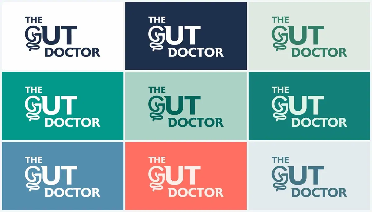
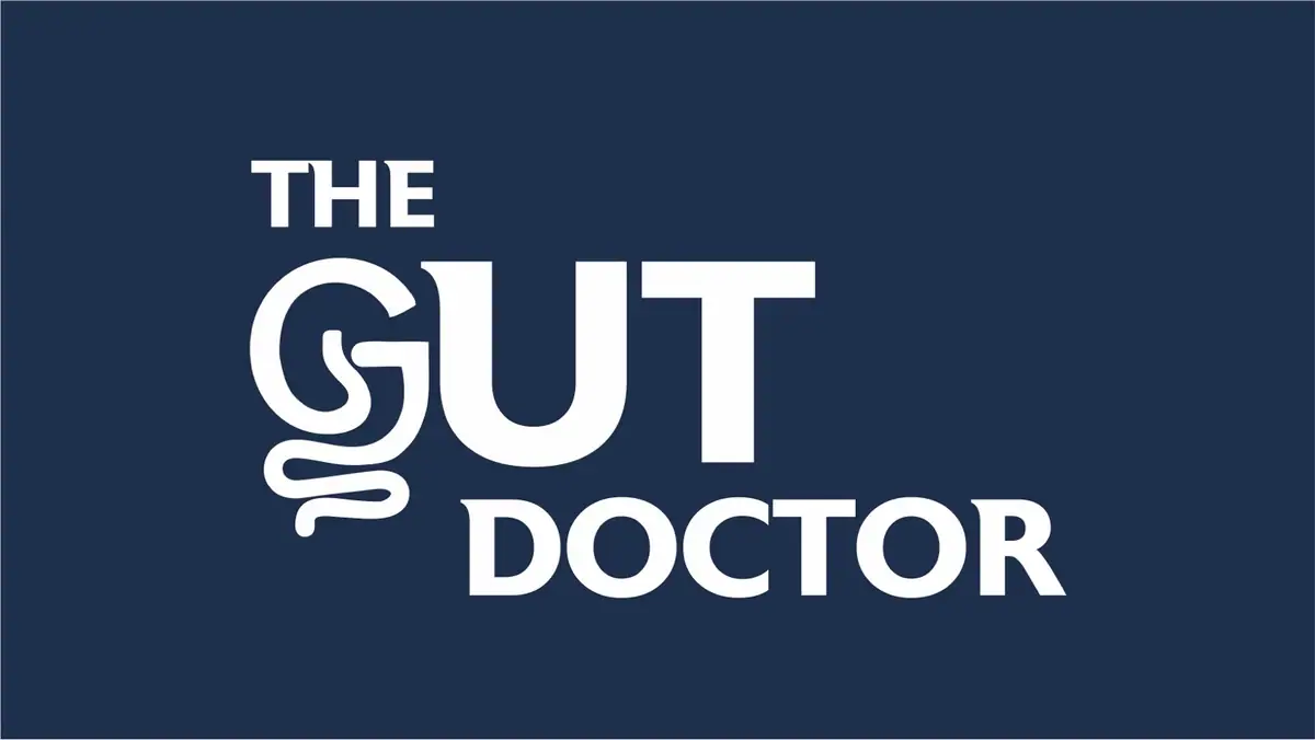
A stacked THE / GUT / DOCTOR wordmark whose G is a coiled intestine, plus the intestine on its own as an icon. Delivered in 9 colourways and 8 icon colours.
A colour system with rules
Navy #06233F and teal #23A79A lead. Mints, a deep teal and a scientific blue add depth. Coral and clinical orange are accents only. Each tier has usage rules and do's and don'ts.
Hindi first, everywhere
The Veda Arogya website, pamphlet and ads lead in Hindi, with English where it helps. Every ad ends on the clinic's WhatsApp line and address.
Chapter by chapter.
10 chapters, in the order the brand was built.
One document for every team
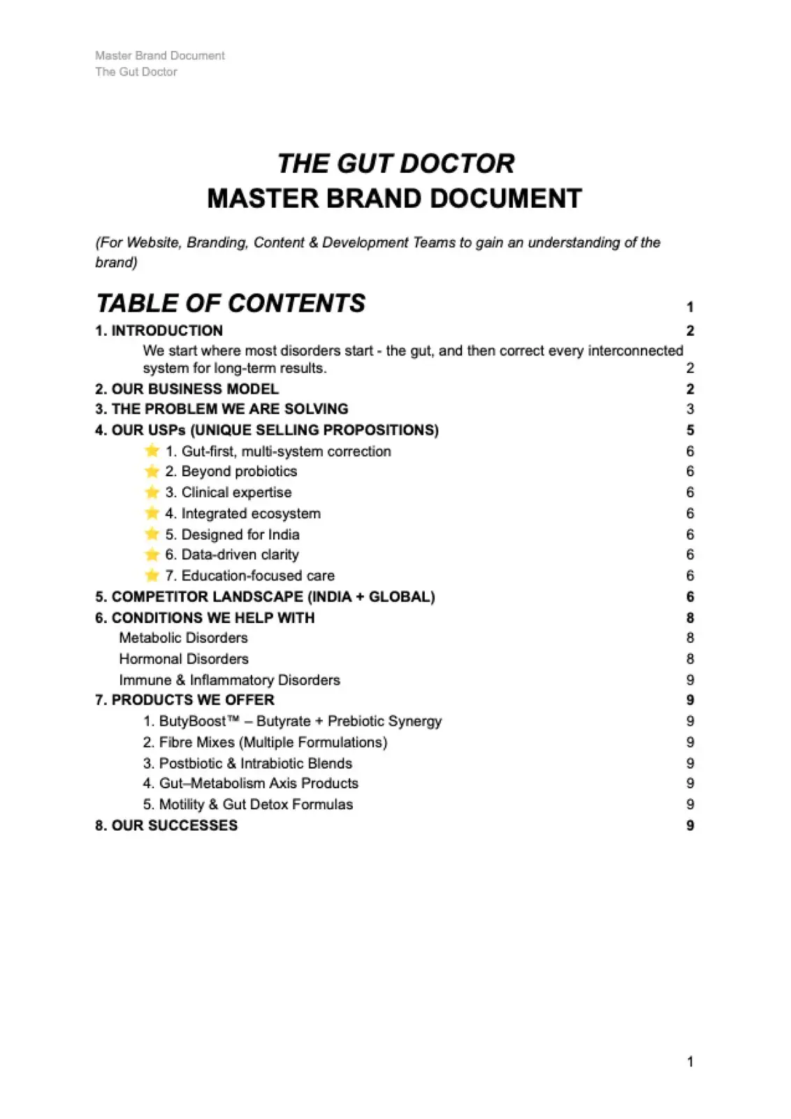
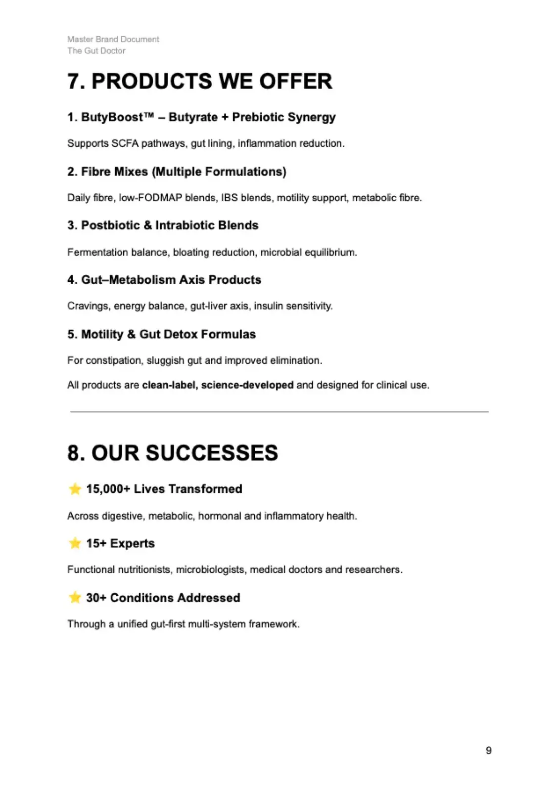
Before the mark, we wrote the Master Brand Document: who The Gut Doctor serves, the problem it solves, seven USPs, an India and global competitor map, the conditions it treats and the products it plans.
It positions The Gut Doctor as gut-first care: start with the gut, then correct every connected system.
The G is a gut
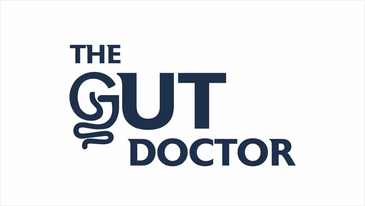
A stacked wordmark, THE / GUT / DOCTOR, set heavy and upright. The G is drawn as a coiled intestine that trails below the baseline.
The intestine also stands alone as a logomark for avatars, icons and small spaces. Final files were delivered on 3 December 2025.

Navy and teal lead, coral only accents
The palette usage guide sets six tiers: primary, secondary, depth, accent, neutrals and functional UI. Each colour has a hex value, a job and a section-by-section rule.
The logo ships in nine colourways and the logomark in eight, all drawn from that palette.

vedaarogya.in, in Hindi and English
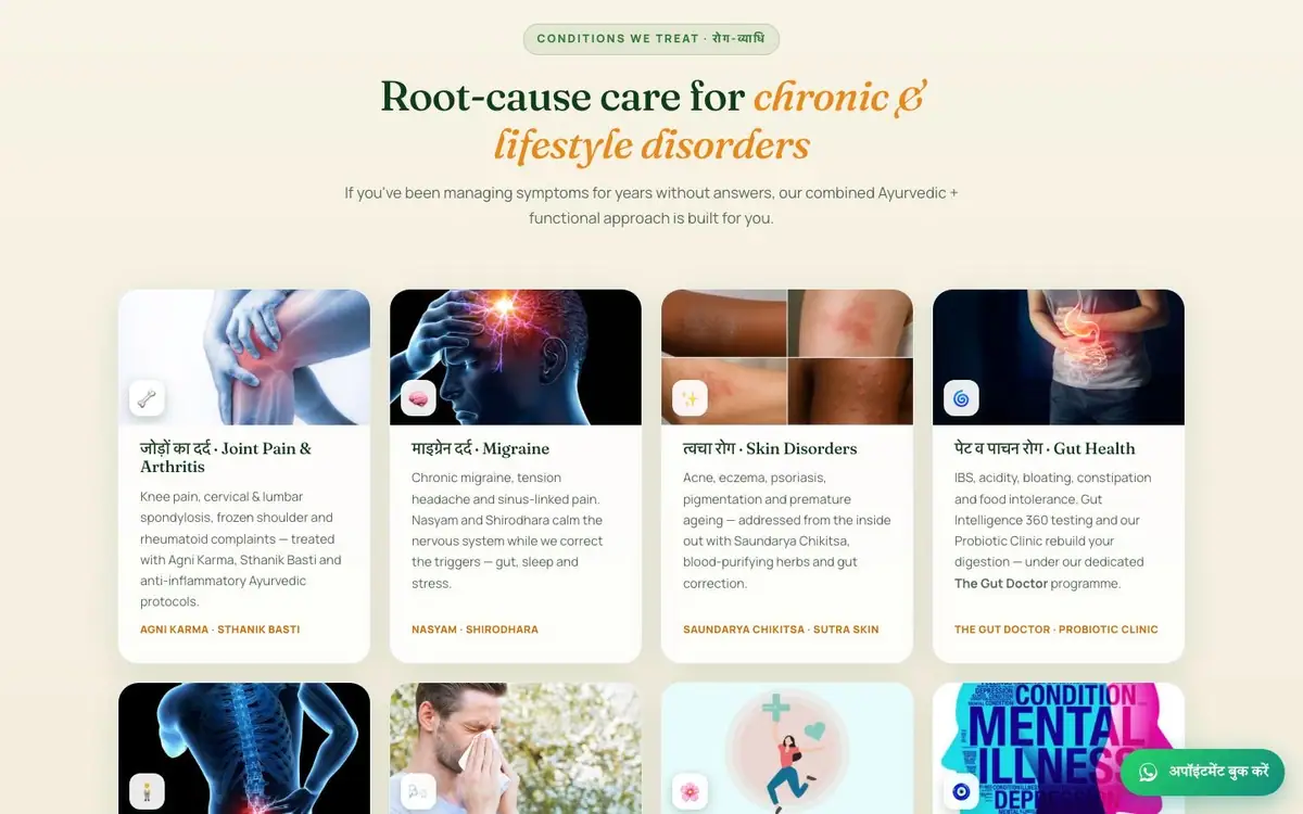
The parent clinic's site is bilingual and live: hero, the doctor, guiding principles, a conditions grid and therapies. The Gut Health card routes patients to The Gut Doctor's Gut Intelligence 360 testing and probiotic clinic.
For The Gut Doctor's own site, we wrote the brief for an 11-page site and the full homepage copy, which opens on 'When Your Gut Works, Everything Works.'


One A4 sheet, four clinics
An A4 Hindi pamphlet presents Veda Arogya as an AI-integrated Ayurvedic clinic with four sub-clinics: Natural GLP-1, Pain Management, The Gut Doctor and Aesthetic & Cosmetic. Doctor timings and the clinic address close the page.
We set it in two layouts: a boxed grid and a numbered list.


Deep green, gold and three numbers
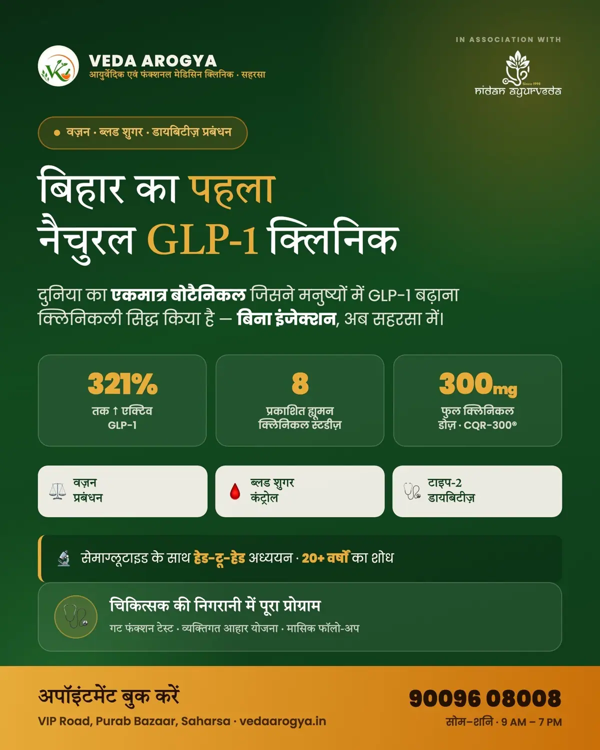
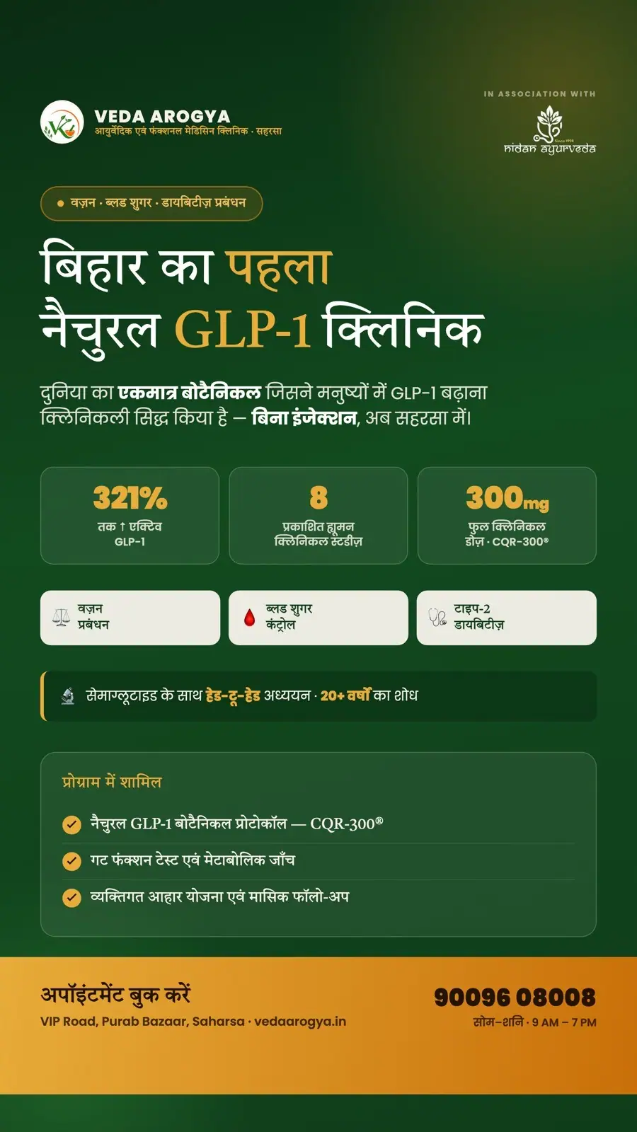
The August 2026 launch ads for the Natural GLP-1 clinic use a deep green field, gold type and a band of three stat tiles. They were made in 1:1, 4:5 and story sizes, in association with Nidan Ayurveda.
The Meta campaign's first round used the same system before moving to photography.
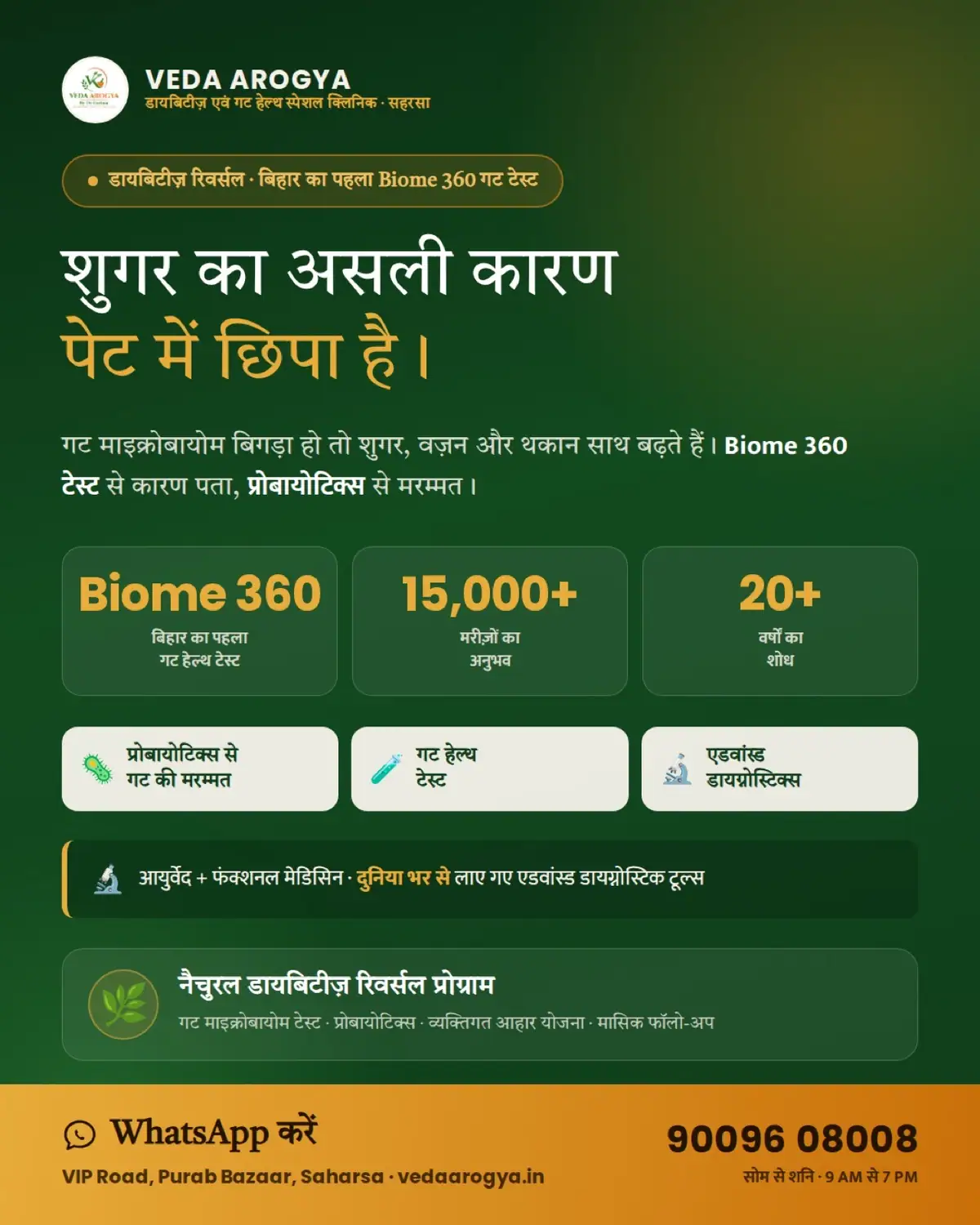
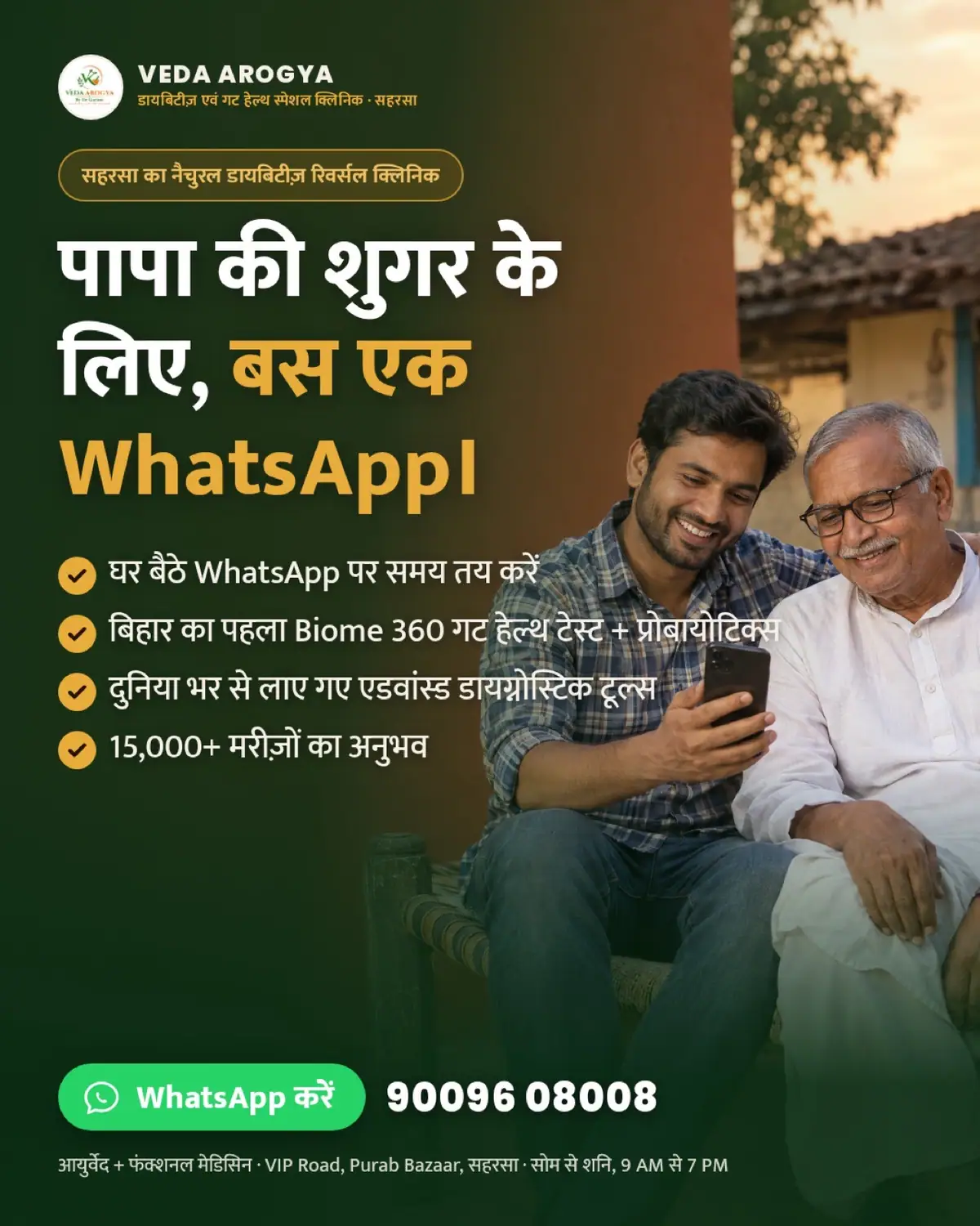
Five Hindi concepts, one WhatsApp button
September 2026: a Click-to-WhatsApp campaign set up in Hindi for Saharsa and 40 km around it. Five concepts, each in 4:5 for feed and 9:16 for stories and reels.
Each one opens on a real worry, from rising medicine doses to a father's sugar, and ends on the same green WhatsApp button.
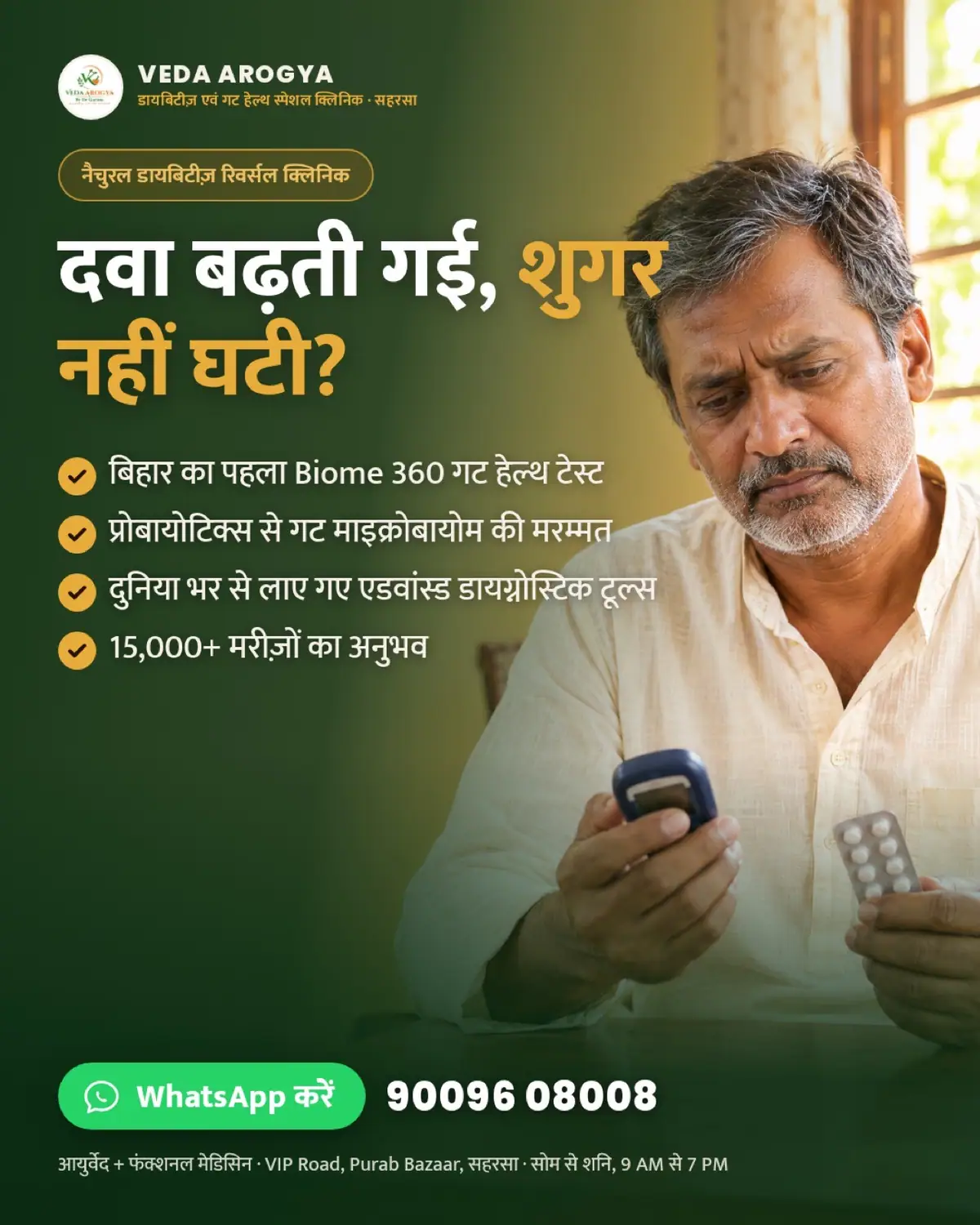

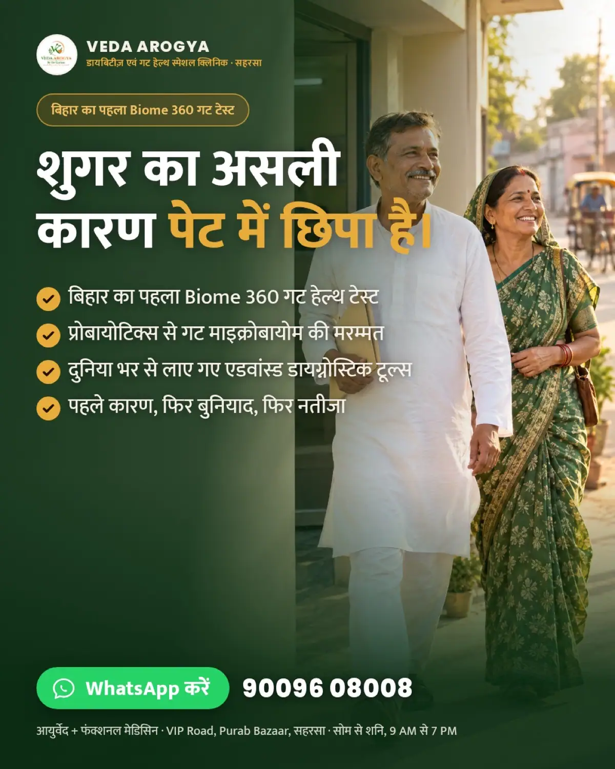
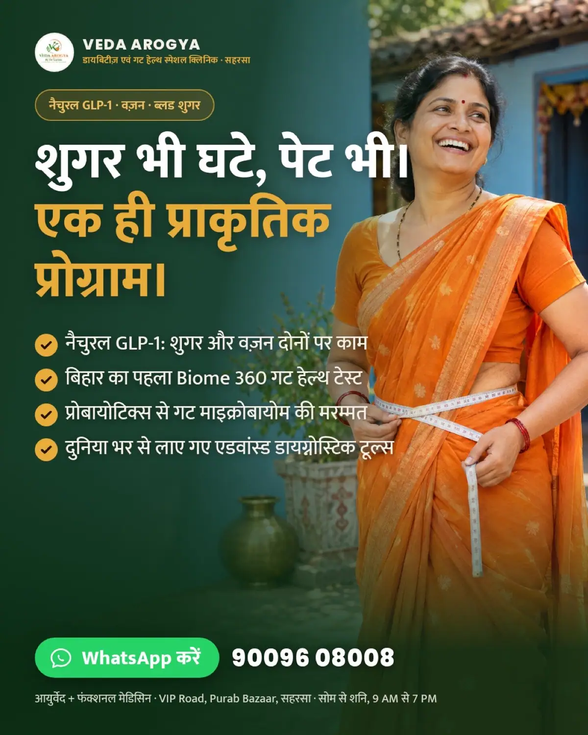
One ad per clinic line
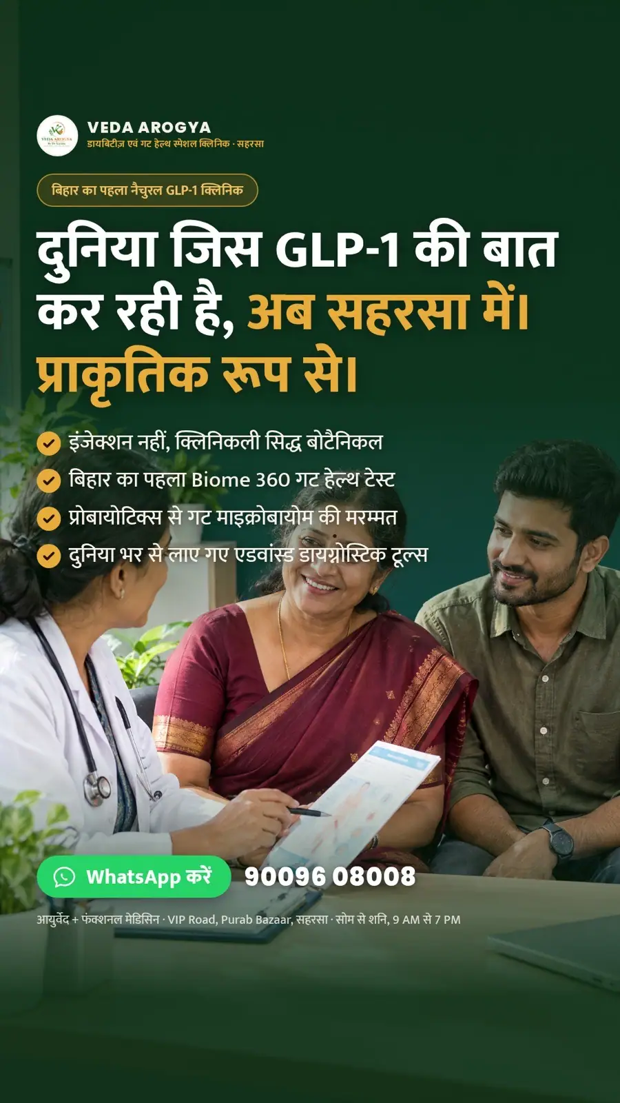
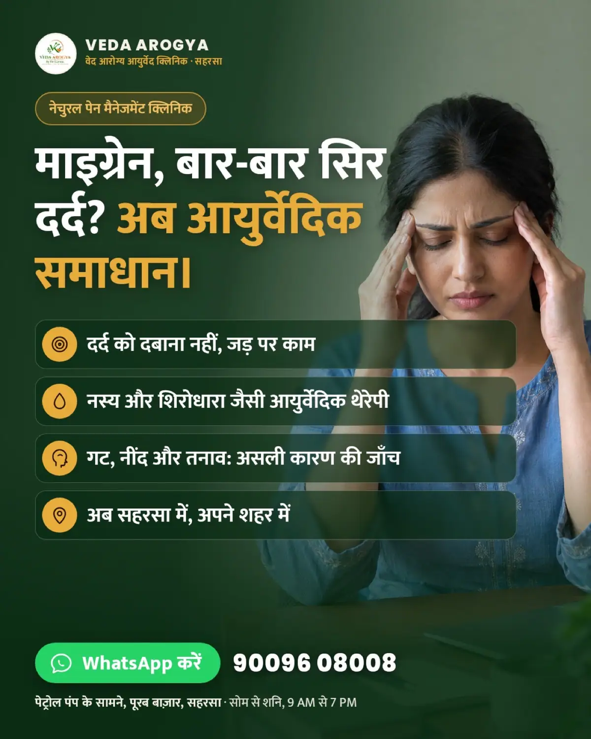
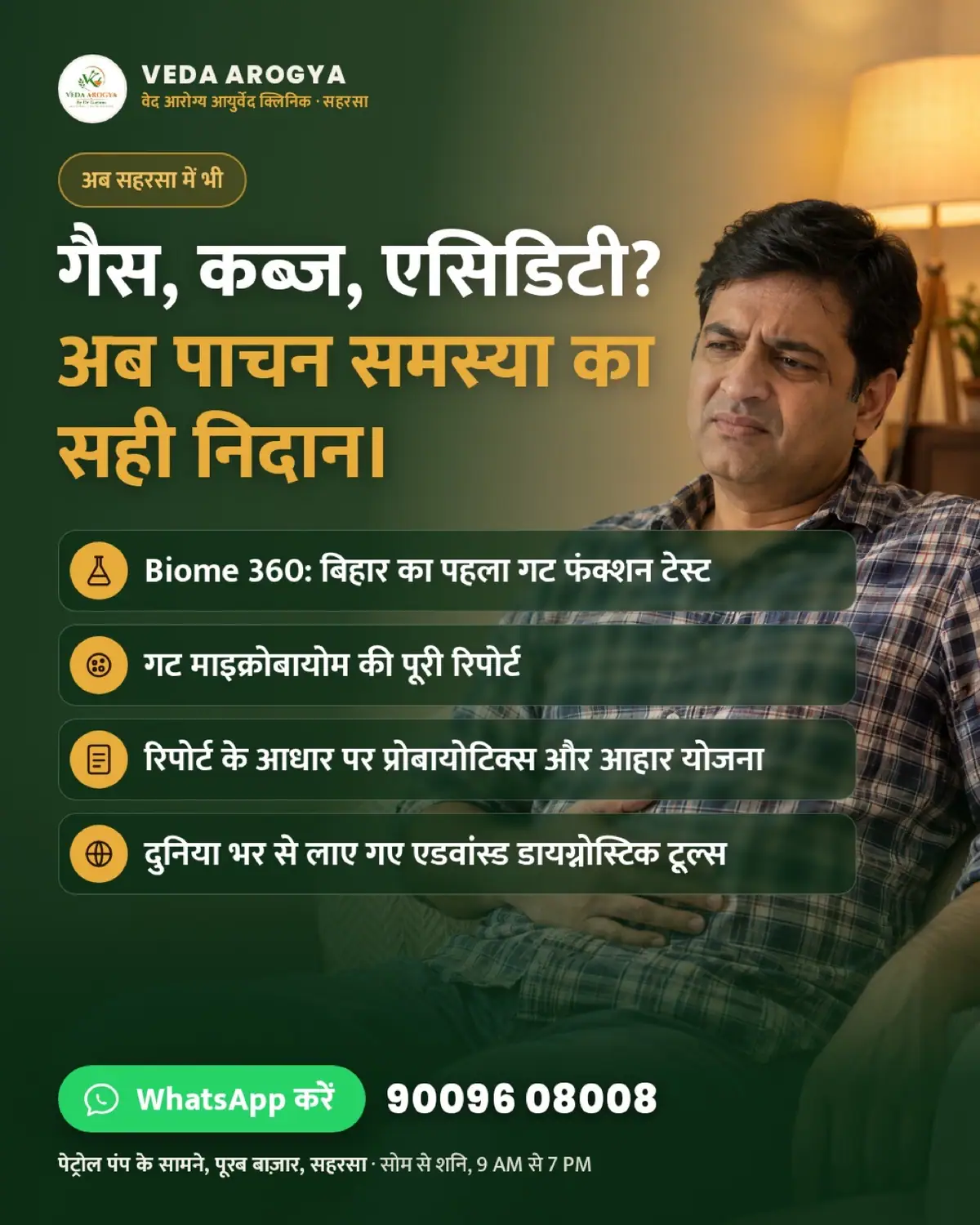
Four service ads in the same photographic system: GLP-1 and diabetes, migraine, gut problems with the Biome 360 gut test, and skin and hair. The gut ad carries The Gut Doctor's test into the feed.

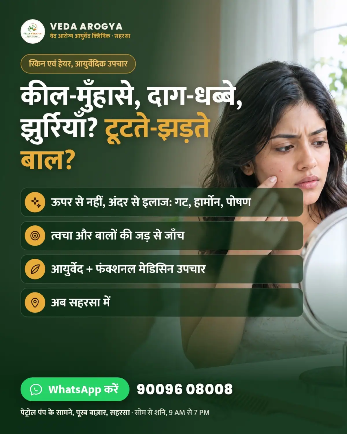
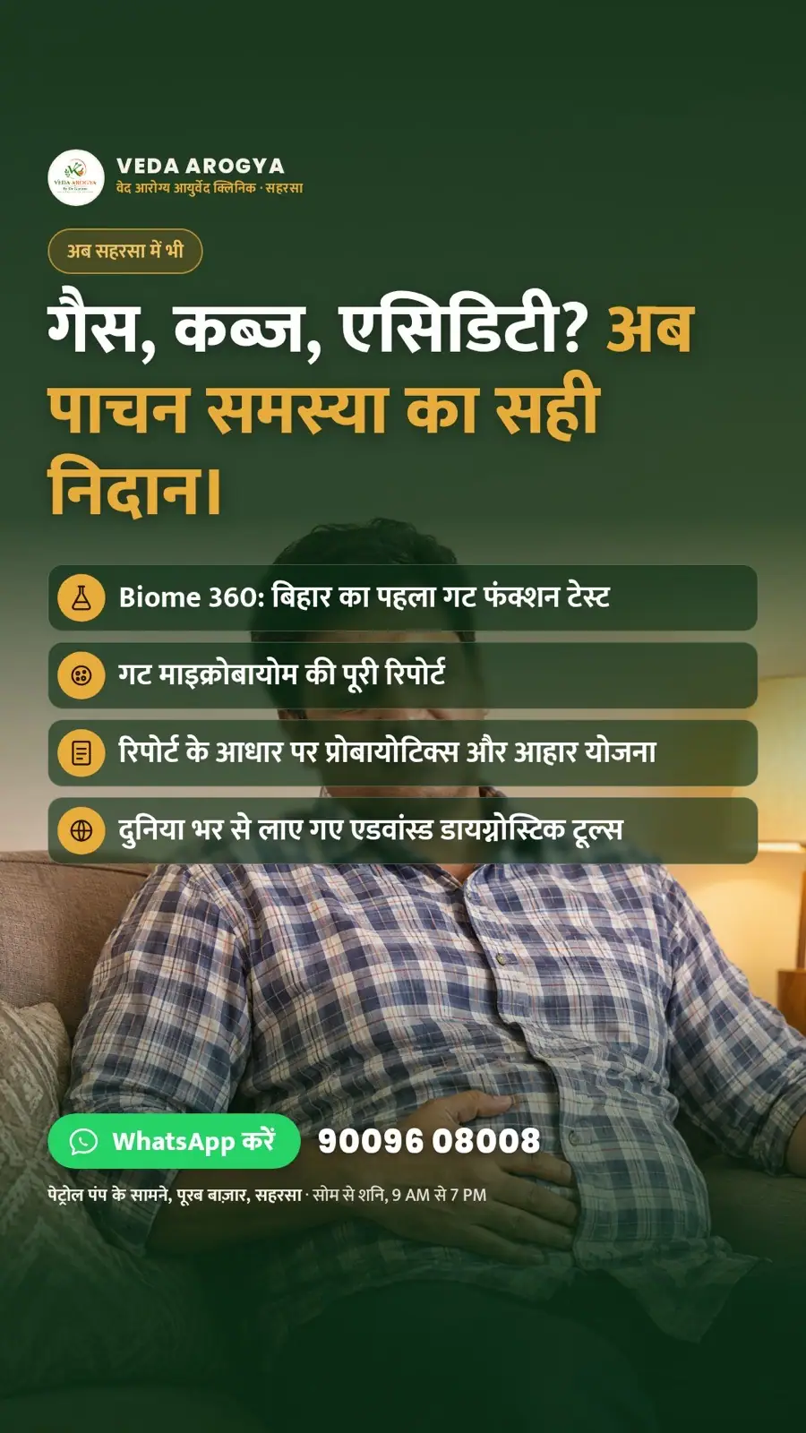
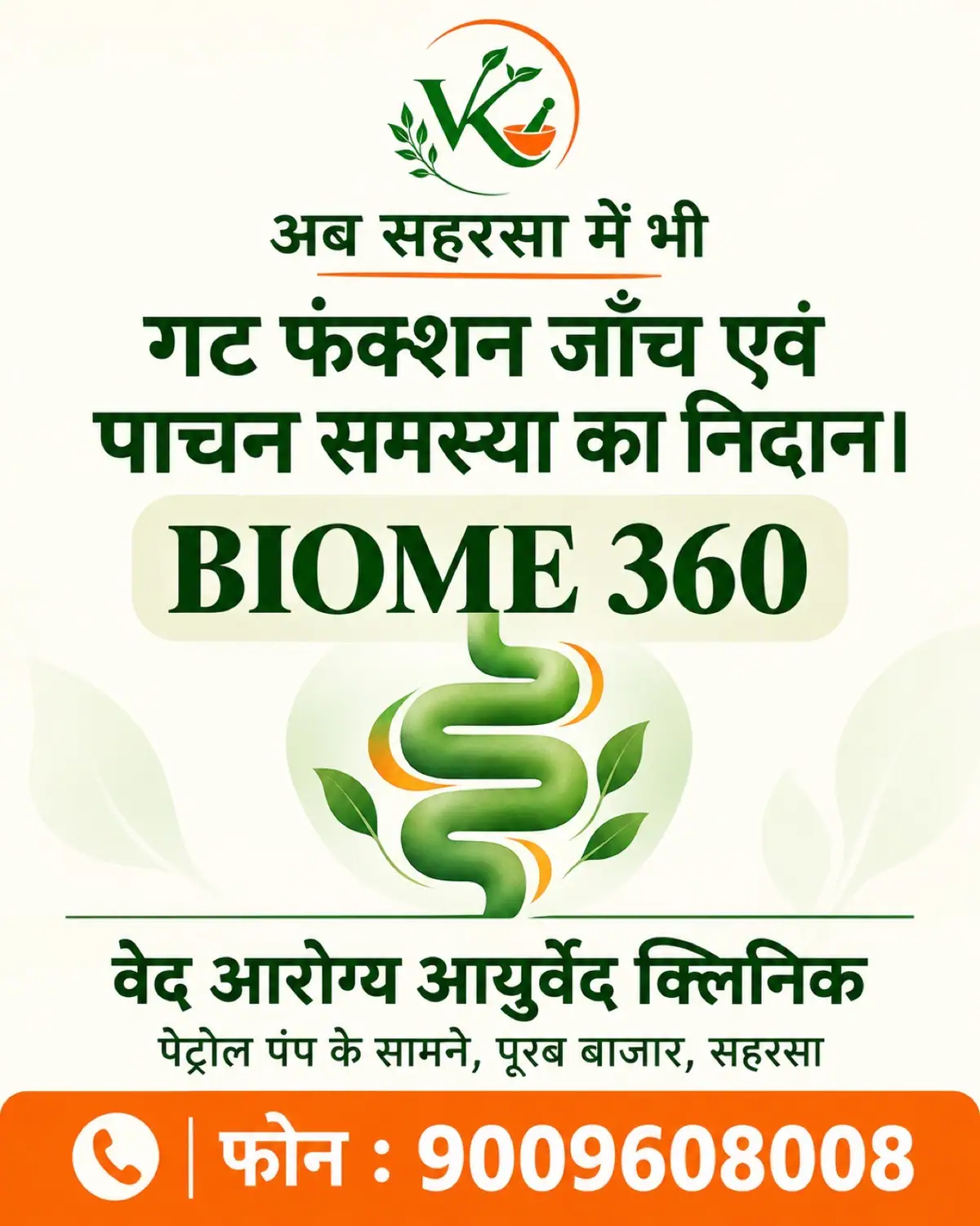
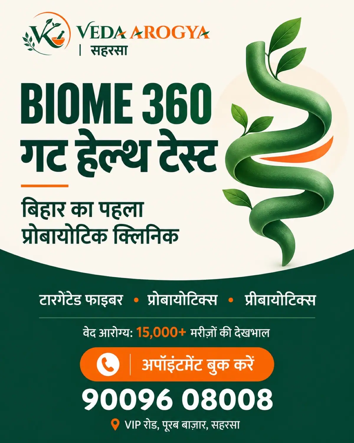
Cream, line art and one orange band
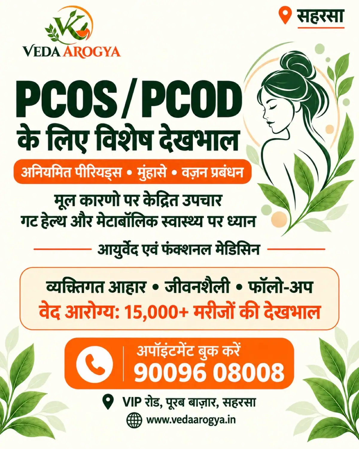
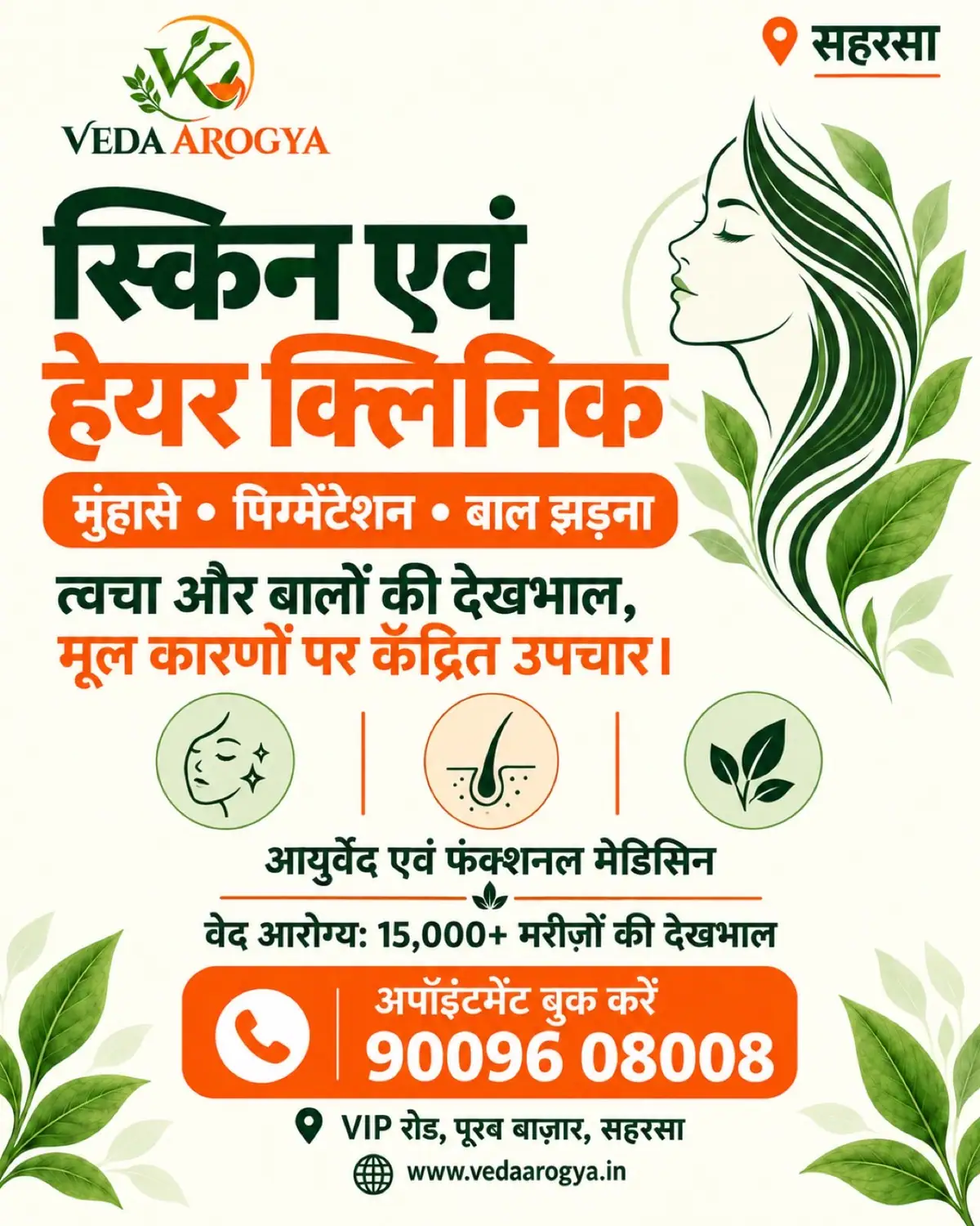
Alongside the photographic set we made a lighter direction: cream grounds, green line illustration and an orange call band. Five topics: Biome 360, gut health, diabetes, PCOS/PCOD, and skin and hair.

Logo colourways + logomark colours
Colour system, hex to usage rules
Hindi/English clinic website, live
Meta concepts + service ads, 4:5 and 9:16
- Master Brand Document (positioning, USPs, competitors, conditions, product range)
- Stacked wordmark with intestine G
- Standalone intestine logomark
- 9 full-logo colourways and 8 logomark colours
- Colour palette usage guide: 6 tiers with hex values and usage rules
- Collaborations & partnerships creative
- Bilingual Hindi/English clinic website, vedaarogya.in
- A4 Hindi clinic pamphlet, 2 layouts
- GLP-1 clinic launch ads in 1:1, 4:5 and story
- Hindi Click-to-WhatsApp Meta campaign: 5 concepts in 4:5 and 9:16
- 4 photographic service ads
- 5 illustrated and minimal alternative ads
Got a product?
Let's give it a name.
Tell us what you're making, where you'll sell it and when you want it on shelf. We reply within one working day.
The mark on the coat
A collaborations and partnerships creative puts the logo on the pocket of a doctor's coat. The mark holds up at pocket size.