Nidan Ayurveda
A family vaidya's trust, written into one brand book.
- Client
- Client — Ayurvedic clinic, Bihar, since 1998
- Year
- 2026
- Services
- Brand book, Colour & type, UI components, Iconography, Voice, Website
- Result
- 8 chapters One brand book, essence to feel
- Identity system
- Brand guidelines
- Website
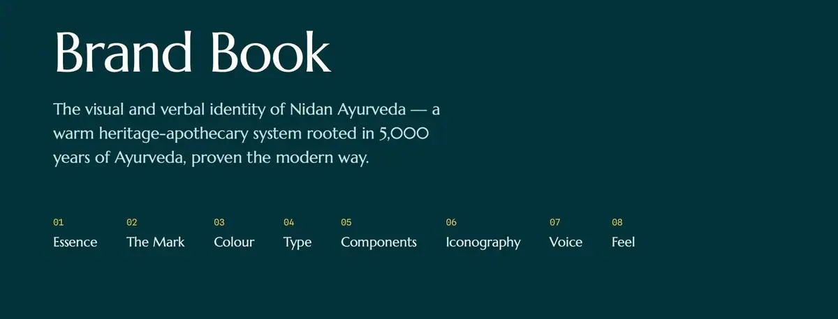
Nidan Ayurveda has run as a family clinic since 1998, with centres in Singheshwar and Bhimnagar in Bihar. It already had a strong mark: a white botanical growing from a stethoscope loop. What it lacked was a written system around it.
The brand had to read as heritage and modern proof at once, and stay calm next to louder wellness brands.
Nidan's edge was not tradition or science alone, but the handshake between them.
What we did.
Nidan Ayurveda has treated families since 1998 and wanted to look like what it is: "A trusted family vaidya, not a hype-driven brand." We kept its botanical-stethoscope mark and built the system around it: an eight-chapter brand book and a site rebuild.
Keep the mark
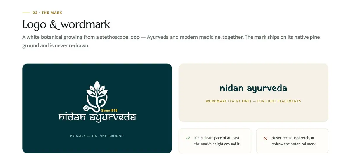
The botanical-stethoscope logo already joins Ayurveda and modern medicine in one line. The book fixes its use: on its native pine ground, clear space of at least its own height, never recoloured or redrawn.
Colour sampled from the logo
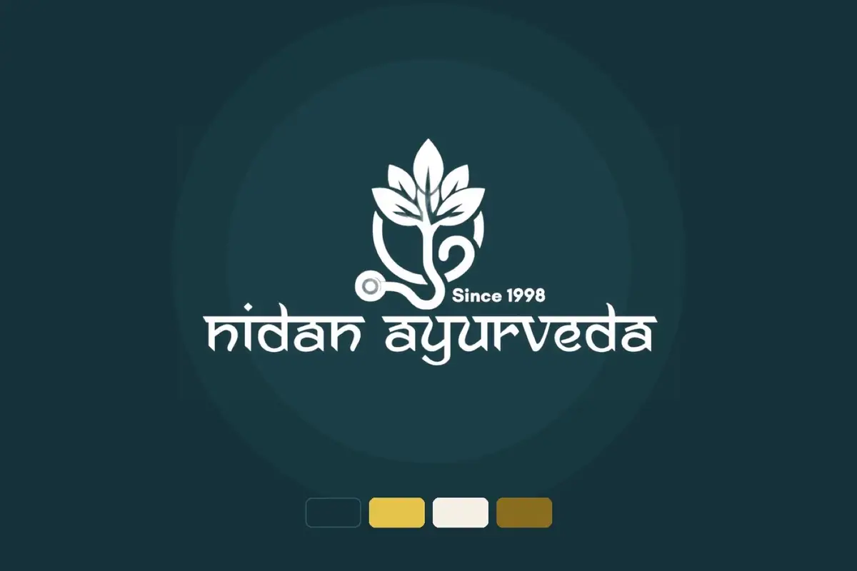
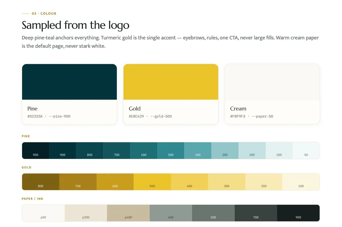
Pine #02333A anchors everything. Gold #EBC429 is the single accent, never a large fill. Cream #FBF9F3 is the default page, never stark white. Each has a full tint ramp.
Type with clear jobs
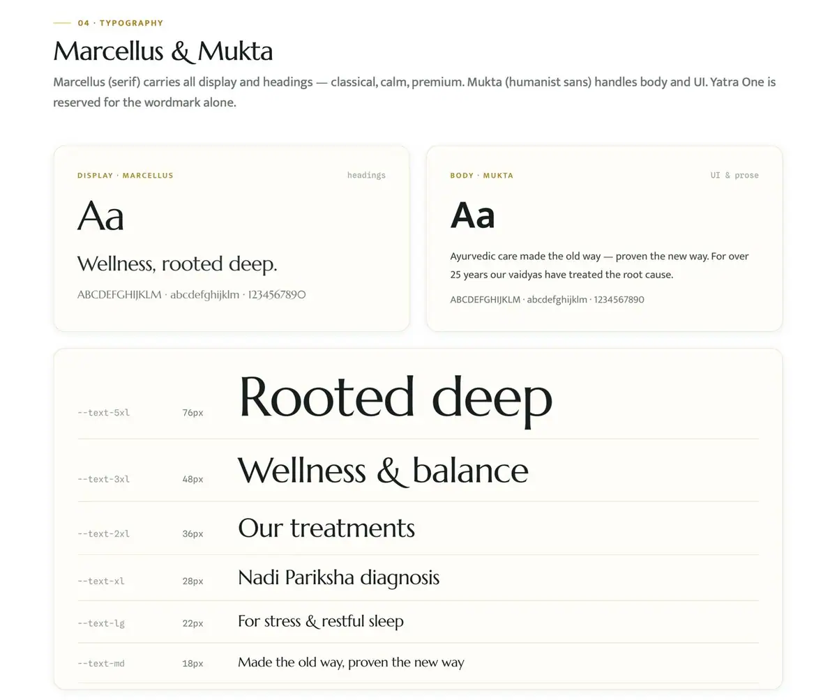
Marcellus carries display and headings. Mukta handles body and UI. Yatra One is kept for the wordmark alone.
Components, rendered live
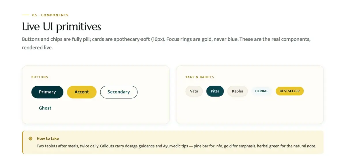
Pill buttons, dosha chips, badges and a dosage callout, built as real UI. Lucide icons at 1.75px stroke and one gold eight-point glyph for flourishes.
A voice with rules
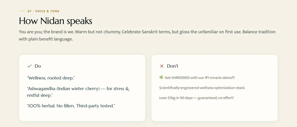
Warm but not chummy. Sanskrit terms celebrated, then glossed. The Don't column strikes out the miracle-detox lines Nidan will never use.
Chapter by chapter.
6 chapters, in the order the brand was built.
Eight chapters, one essence
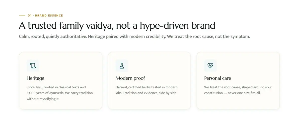
The brand book opens on one line: "A trusted family vaidya, not a hype-driven brand." Three values follow: heritage, modern proof and personal care.
Eight chapters run from Essence to Feel, with the mark, colour, type, components, iconography and voice in between.
Kept, and given rules
The logo predates the book, so we left it alone and wrote its rules: primary on pine, the Yatra One wordmark for light placements, clear space of at least the mark's height, no recolouring or redrawing.
Pine leads, gold accents, cream is the page
Three colours sampled from the logo, each with a full tint ramp for UI states and print.
Marcellus for headlines, Mukta for reading, set on a scale from 76px down to 18px.
Real components, not pictures of them
Buttons and chips are fully pill-shaped. Cards use soft 16px corners. Focus rings are gold. A 'How to take' callout carries dosage guidance.
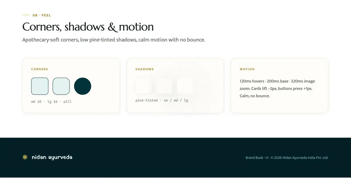
Twelve Lucide line icons are drawn in pine ink. Corners, shadows and motion timings close the system: calm, with no bounce.

Warm, specific, never a miracle
"Wellness, rooted deep." sits in the Do column. Hype lines are struck through in the Don't column, so the next writer knows exactly where the line is.
A rebuild that starts with one line
In August 2026 we built a seven-page Next.js rebuild for nidanayurveda.com: Home, About, Conditions with 12 guides, Diagnostics, Book Appointment, Awards & Media and Contact, with an appointment intake form and structured data.
It leads with "Your health is a system. Nidan looks for what changed."

Brand book: essence to feel
Pine, Gold, Cream, each with a tint ramp
Display, body, wordmark
Site rebuild, plus 12 condition guides
- Eight-chapter brand book, v1 (2026)
- Logo usage rules: clear space, ground, no recolouring
- Colour system: Pine, Gold and Cream with full tint ramps
- Type system: Marcellus, Mukta, Yatra One
- Live UI components: buttons, dosha chips, badges, dosage callouts
- Lucide icon rules and a gold eight-point glyph
- Voice do's and don'ts
- Feel: corners, shadows and motion
- Website rebuild: 7 pages and 12 condition guides
- Social preview image for the rebuild
Got a product?
Let's give it a name.
Tell us what you're making, where you'll sell it and when you want it on shelf. We reply within one working day.